In today’s printing landscape, achieving top-quality prints and precise color often relies on skilled print operators. However, there’s a shortage of these experts. This is noticeable in industries integrating print into broader processes, where non-specialists take on printing tasks. In this new series, Nigel Wild, product manager at Global Graphics Software, delves into the world of color and explains some key terminology. This week he explains color space.
Understanding color spaces
A quick guide to RGB, CMYK and LAB
If you’ve ever printed something that looked nothing like it did on your screen, you’re not alone—and color spaces are the reason why. In this quick guide, I’ll break down the three most common color spaces—RGB, CMYK, and LAB—so you know when (and why) to use each one. No jargon, just the good stuff. Let’s go!
🌈 RGB Color space – Red, Green, Blue
Used for: Screens (phones, TVs, web, cameras)
Type: Additive (light-based)
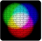
RGB is the color language of anything that glows. It mixes red, green, and blue light to create colors.
What does additive mean?
In the additive color model, you start with black (no light) and add red, green, and blue light to create other colors. The more light you add, the brighter the color gets—mix all three at full intensity and you get white.
- Black = no light (R=0, G=0, B=0)
- White = full light (R=255, G=255, B=255)
But here’s the catch:
RGB is device dependent. That means the same RGB values can look different on different screens. Blame screen calibration, display types (OLED vs LCD), and even room lighting. Just go to a TV showroom and look at the differences between the TV device on display.
👉 Best for: Anything staying on-screen.
🚫 Not great for: Printing—printers rarely speak RGB.
🖨️ CMYK – Cyan, Magenta, Yellow, Black
Used for: Printing (packaging, labels, posters, brochures)
Type: Subtractive (ink/pigment-based)
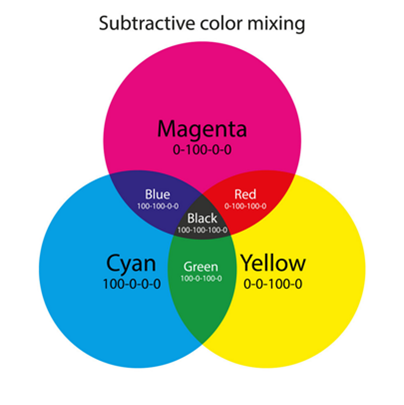
CMYK is how printers create color. Instead of adding light, it removes it using ink. Think paint mixing:
What does subtractive mean?
In the subtractive color model, you start with white (paper) and add layers of ink to subtract certain wavelengths of light. The more ink you add, the darker the result. Mix all inks and you (almost) get black.
- White = paper (no ink)
- Black = all inks layered (C+M+Y+K)
But here’s the catch:
CMYK is device dependent. It depends on many things including pigments used in inks, printing process, substrates, just compare your newspaper to a glossy brochure, or a vibrant label.
🎯 But: CMYK has a smaller color range than RGB. Bright neon colors? Not happening. That’s why your printed designs can sometimes look dull compared to their on-screen versions. That is why some printers use additional colorants like Orange, Green and Violet to extend the gamut as well as optical brighteners built into the substrates.
👉 Best for: Anything going to a physical printer.
🚫 Not great for: Screens or vibrant digital-only designs.
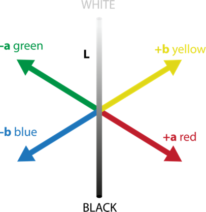
🧠 LAB – Lightness, A (Green-Red), B (Blue-Yellow)
Used for: Color comparison, correction, professional color workflows
Type: Device-independent
LAB is like the universal translator of color. It doesn’t care what screen or printer you’re using—it describes color in terms of how we see it, not how a device displays it.
Imagine this…Living in the Color Space
You’re standing right at the centre of a giant 3D color space, like you’re in the middle of a holographic cube or sphere.
Horizontal Plane 1: Yellow to Blue
Look straight ahead. Now slowly turn your body from left to right.
- To your left, colors get more and more yellow, super vivid.
- As you turn through the centre, colors become neutral—they lose saturation.
- Keep turning to the right, and colors shift into deep, rich blues.
This axis is called the B-axis (blue-yellow).
Horizontal Plane 2: Green to Red
Now face forward again and imagine walking forward and back:
- Walk forward, colors turn lush and green.
- Back away, through the neutrals and they become redder.
This is the A-axis (green-red).
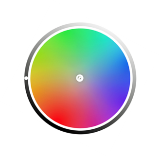
Both the A and B axes are like a flat floor around you, forming a 2D grid of hue and chroma. The closer you are to the middle, the more muted and grey the colour becomes. The closer to the outside edge, the more vibrant the color becomes.
Veritcal Axis: Lightness
Now look up.
- The higher you look, the lighter the colors become—pastels, pale shades, all the way to bright white at the very top.
- Look down. Colors grow darker, descending into deep shadows, all the way to black.
This is the L-axis (Lightness).
🎨 Every color lives here
Now spin around and look in any direction—literally every color you can see or imagine has a unique point in this space:
- A soft pink? Somewhere high, slightly toward red and yellow.
- A forest green? Lower down, further toward green and a little darker.
- A light grey? Almost straight up from the centre, near the light axis, but neutral on both A and B.
Each of those colors can be plotted with three coordinates—L, A, and B. That’s what makes LAB so powerful: it’s not just red, green, blue—it’s how we actually perceive colour in space.
👉 Best for: Color matching, comparing, or converting between any color, no matter how it is produced RGB and CMYK.
🚫 Not intuitive to work in directly—but we have great software to work things out.
🚦 So… which should you use?
If you are making device-specific adjustments then use a device color space like CMYK or RGB, however if you are trying to match a specific color, LAB is the way.
If you are trying to match one device with another, because every color has its own unique value, this value remains constant no matter what device it is produced by and differences between colors can be calculated. This difference is known a ∆E, stay tuned because there will be more on that topic later.
🎯 Final thoughts
Knowing how color spaces work—and when to use them—can be the difference between a color catastrophe and a spot-on masterpiece.
Whether you’re a designer, printer, or just someone who wants their blues to actually look blue, understanding color spaces gives you the power to create and control color confidently across any medium.
Coming up next:
- 🔍 What is ∆E—and why can it be different for the same colors?
- 🎨 What is a Gamut, and how does it affect your print quality?
Stay tuned!
About the author
Nigel Wild is an applications specialist and responsible for workflow in SmartDFE™. He joined Global Graphics Software in 2022 after working in workflow automation for many years. Nigel has worked in the printing industry in most areas, from prepress, printing, supplying services, hardware and software solutions.
Read more
- Spot colors: their crucial role in the world of printing
- Processing PDF without in-RIP color management
Be the first to receive our blog posts, news updates and product news. Why not subscribe to our monthly newsletter? Subscribe here


