
In his third post about understanding color, application specialist Nigel Wild explains Delta E.
Understanding Delta E
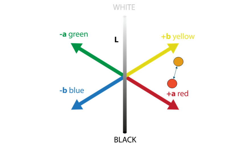
What is Delta E (∆E)?
Now that you understand color spaces, LAB, and gamut, it’s time to meet Delta E (∆E)—your ruler for color accuracy.
In simple terms, Delta E measures the difference between two colors in LAB space. The higher the ∆E, the greater the visual difference.
How to interpret Delta E values
| ∆E Value | What it means |
| ∆E = 0 | No difference, colors are identical |
| ∆E < 1 | Nearly invisible difference |
| ∆E 1–2 | Slight difference, only noticeable to experts |
| ∆E 2–3 | Small difference, visible if viewed side by side |
| ∆E 3–5 | Moderate difference, noticeable in normal viewing |
| ∆E 5–10 | Significant difference, colors clearly differ |
| ∆E > 10 | Huge difference, colors look completely different |
Common industry tolerances
Delta E is essential in printing, design, and manufacturing to maintain color consistency across devices, materials, and production runs. For example, a ∆E ≤ 1 is acceptable for high-precision work, such as in branding, proofing and luxury print. ∆E ≤ 2–3 is standard for most professional printing and manufacturing, and ∆E ≤ 5 is acceptable for less color-critical outputs, for example when printing textiles or posters.
Visualizing Delta E in Smart Media Manager

These images are taken from our Smart Media Manager, a component that manages color and quality in SmartDFE™.
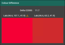
The image above shows the difference between a color that is out of gamut and the closest match that can be achieved using the CMYK of the printer.
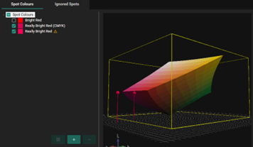
The image above shows a 3D color space—representing the gamut volume of a printer. Users can interactively rotate the space, visually exploring what colors fall inside or outside the printer’s achievable range. Smart Media Manager also clearly marks the colors that cannot be accurately matched using this printers current setup.
In summary:
✅ In-gamut color: The printer can accurately reproduce it.
❌ Out-of-gamut color: The printer cannot reproduce it precisely. When that happens, the system calculates a ∆E value of the closest colour that can be printed — quantifying the expected color shift.
Different ways to calculate ∆E
Just when you thought you had it nailed… there are several methods of calculating ∆E—some more accurate than others:
1. ∆E76 (CIE 1976) – The basic formula
A simple distance calculation in LAB space.
✅ Easy to compute
❌ Doesn’t reflect human vision well (e.g. overestimates blue differences)
2. ∆E94 (CIE 1994) – Improved weighting
Introduced weighting factors to improve visual correlation.
✅ Better than ∆E76
❌ Still struggles with some hues, like blues and skin tones
3. ∆E2000 (CIEDE2000) – The gold standard
The most advanced method. It adjusts for:
- Hue sensitivity (some colors stand out more than others)
- Chroma scaling (bright colors behave differently)
- Lightness perception (dark colors need finer tuning)
✅ Most accurate, matches human visual response
❌ More complex to calculate
Which Delta E should you use?
| Delta E method | Use case |
| ∆E76 | Historical data, basic comparisons |
| ∆E94 | Legacy workflows, some older systems |
| ∆E2000 | Modern printing, textiles, automotive finishes |
Most industries today rely on ∆E2000, because it best reflects how we actually perceive colour differences.
Final thoughts
Delta E is your universal measuring tape for color difference. It helps ensure your colors stay consistent from design to final output—whether you’re printing a brochure, manufacturing textiles, or matching paint on a sports car. If you’re serious about color precision, then ∆E2000 is your best friend.
Coming up next: The importance of measuring color
In the next article, I’ll look into the practical side of color management—starting with one of the most important foundations: measurement. Accurate color begins with accurate data, and that means:
- Understanding how color is measured
- Using the right tools and techniques
- Ensuring consistency in your process
We’ll explore:
- Why good measurements matter more than you might think
- What can go wrong (and how to catch it early)
- Practical tips to verify and validate your color data at every step
About the author

Nigel Wild is an applications specialist and responsible for workflow in SmartDFE™. He joined Global Graphics Software in 2022 after working in workflow automation for many years. Nigel has worked in the printing industry in most areas, from prepress, printing, supplying services, hardware and software solutions.
Read more
- Everything you need to know about color gamut
- Everything you need to know about color – understanding color space
- Spot colors: their crucial role in the world of printing
Be the first to receive our blog posts, news updates and product news. Why not subscribe to our monthly newsletter? Subscribe here