When we hear the phrase “big data”, we’re meant to think of extremely large data sets that are too complex to process in traditional ways. But, in the context of the next generation of digital presses, you’d be forgiven for thinking it refers to the ultra-high data rates required to drive them.
For example, consider a typical narrow-web label press: 13 inches (330mm) wide, 4 colors, 600x600dpi, running at 230 fpm (70m/min). This requires 0.9 GB/s of raster data to drive it at its rated speed.
Assuming next year’s press adds three more colors (Orange, Green and White) and is upgraded to 1200x1200dpi and expected to run a little faster at 330 fpm (100m/min), the required data rate will jump to 8.6 GB/s: almost a factor of ten increase!
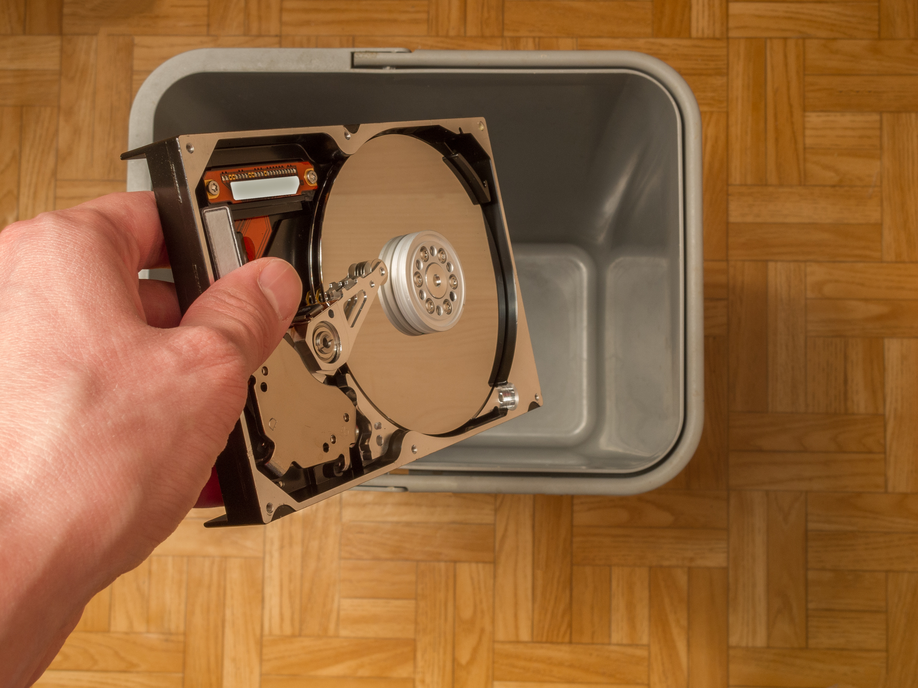
Already this is a data rate far in excess of what the fastest solid-state drives can manage, so what hope is there for a traditional disk-based workflow when moving to 20 inches wide, duplex or 200m/min? Clearly, any part of the workflow involving a disk drive is going to become a bottleneck.
Ditch the disk. Rather than write intermediate raster files to disk between RIPping and screening, or between screening and the printhead electronics, everything takes place in memory.
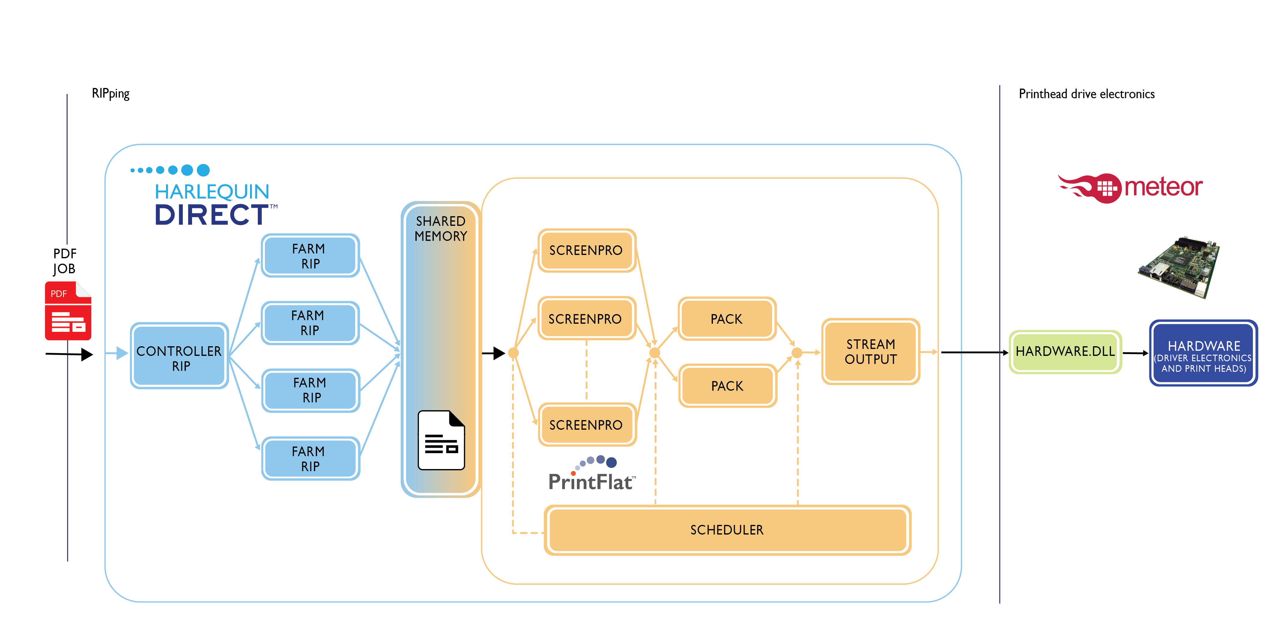
This was one of the reasons behind the creation of Direct™, the integrated software pipeline we announced at the end of April. Rather than write intermediate raster files to disk between RIPping and screening, or between screening and the printhead electronics, everything takes place in memory.
There’s more to future-proofing your press than eliminating comparatively slow disk accesses, however. You’ll need a system that’s scalable and built from the fastest components, which is why Harlequin Direct™ is composed from a configurable number of Harlequin Host Renderer™ and ScreenPro™ instances working in parallel to make the best of the most powerful desktop PCs available.
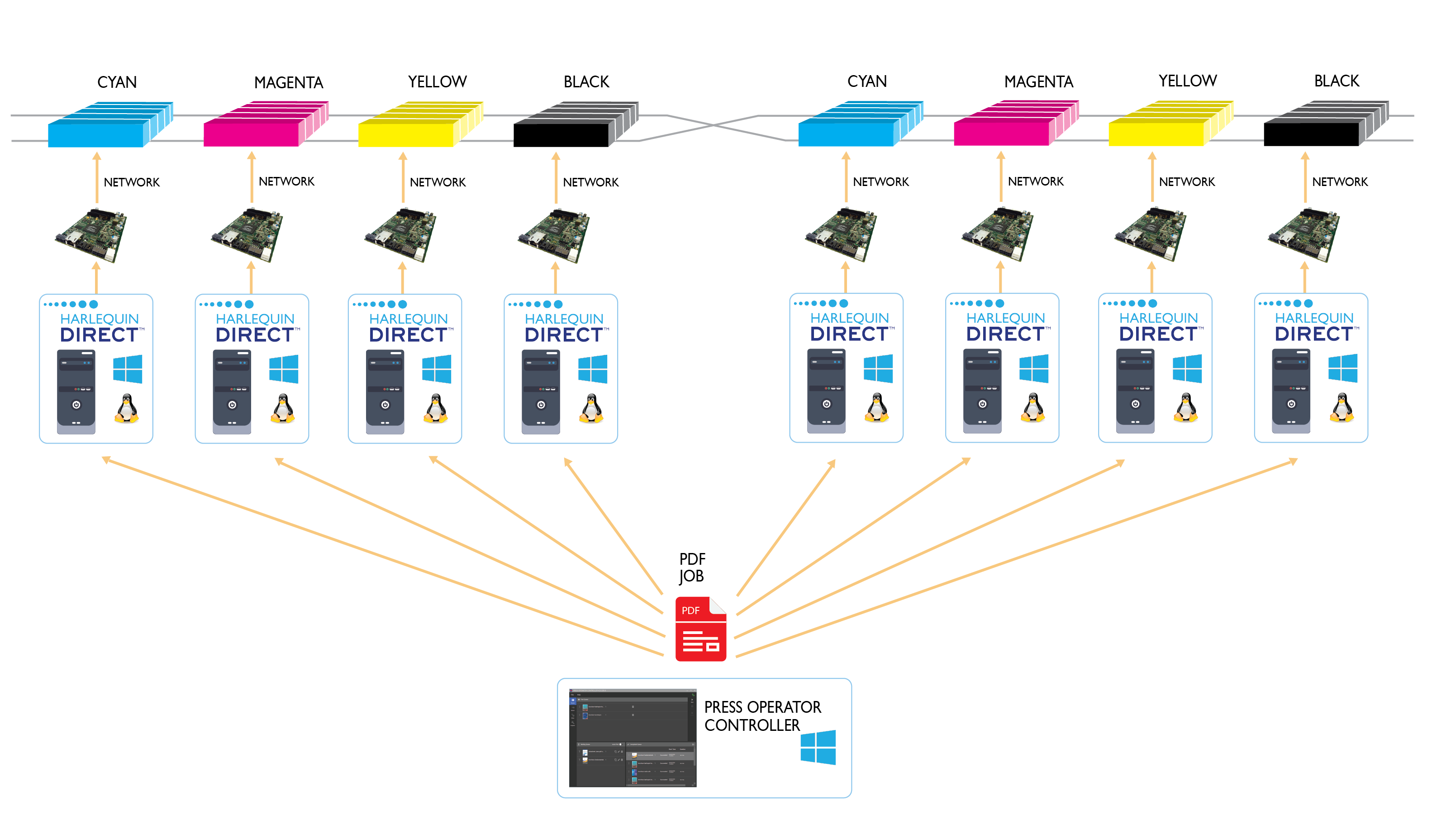
When it comes to adding new colors or supporting duplex, the scalability extends to multiple Harlequin Directs across multiple PCs, one per printbar.
An added advantage of this approach is that each printbar need not use the same resolution or drop-count etc. For example, you might wish to use a lower resolution and disable color management for white or varnish. Our Press Operator Controller user interface is supplied to manage your configuration, along with submitting and controlling your print jobs.
The beauty of a software-only solution like Direct is that once you have built it into your workflow, you are free to upgrade your PCs over time for greater performance without any further software integration expense. A Direct-based system will evolve as your needs evolve, making it the ideal choice for future-proofing your next digital press.
To be the first to receive our blog posts, news updates and product news why not subscribe to our monthly newsletter? Subscribe here
Ian Bolton, Product Manager, Direct
About the author:
Ian has over 15 years’ experience in industry as a software engineer focusing on high performance. With a passion for problem-solving, Ian’s role as product manager for the Direct range gives him the opportunity to work with printer OEMs and break down any new technology barriers that may be preventing them from reaching their digital printer’s full potential.
Halftone screening, also sometimes called halftoning, screening or dithering, is a technique to reliably produce optical illusions that fool the eye into seeing tones and colors that are not actually present on the printed matter.
Most printing technologies are not capable of printing a significant number of different levels for any single color. Offset and flexo presses and some inkjet presses can only place ink or no ink. Halftone screening is a method to make it look as if many more levels of gray are visible in the print by laying down ink in some areas and not in others, and using such a small pattern of dots that the individual dots cannot be seen at normal viewing distance.
Conventional screening, for offset and flexo presses, breaks a continuous tone black and white image into a series of dots of varying sizes and places these dots in a rigid grid pattern. Smaller dots give lighter tones and the dot sizes within the grid are increased in size to give progressively darker shades until the dots grow so large that they tile with adjacent dots to form a solid of maximum density (100%). But this approach is mainly because those presses cannot print single pixels or very small groups, and it introduces other challenges, such as moiré between colorants and reduces the amount of detail that can be reproduced.
Most inkjet presses can print even single dots on their own and produce a fairly uniform tone from them. They can therefore use dispersed screens, sometimes called FM or stochastic halftones.
A simple halftone screen.
A dispersed screen uses dots that are all (more or less) the same size, but the distance between them is varied to give lighter or darker tones. There is no regular grid placement, in fact the placement is more or less randomized (which is what the word ‘stochastic’ means), but truly random placement leads to a very ‘noisy’ result with uneven tonality, so the placement algorithms are carefully set to avoid this.
Inkjet is being used more and more in labels, packaging, photo finishing and industrial print, all of which often use more than four inks, so the fact that a dispersed screen avoids moiré problems is also very helpful.
Dispersed screening can retain more detail and tonal subtlety than conventional screening can at the same resolution. This makes such screens particularly relevant to single-pass inkjet presses, which tend to have lower resolutions than the imaging methods used on, say, offset lithography. An AM screen at 600 dots per inch (dpi) would be very visible from a reading distance of less than a meter or so, while an FM screen can use dots that are sufficiently small that they produce the optical illusion that there are no dots at all, just smooth tones. Many inkjet presses are now stepping up to 1200dpi, but that’s still lower resolution than a lot of offset and flexo printing.
This blog post has concentrated on binary screening for simplicity. Many inkjet presses can place different amounts of ink at a single location (often described as using different drop sizes or more than one bit per pixel), and therefore require multi-level screening. And inkjet presses often also benefit from halftone patterns that are more structured than FM screens, but that don’t cluster into discrete dots in the same way as AM screens.
The above is an excerpt from our latest white paper: How to mitigate artifacts in high-speed inkjet printing. Download the white paper here.
With just a few days to Labelexpo Europe 2019, preparation is in full swing. Come along to booth 9A15 where we’ll be previewing a new version of Fundamentals™, our toolkit for building a digital front end.
Fundamentals is a collaboration between Global Graphics Software and HYBRID Software – and its beauty lies in its simplicity: Fundamentals 2.0 makes it easy for the press operator to keep control of the workflow. Easy step and repeat and nesting via STEPZ with award-winning VDP composition from HYBRID Software makes it possible to estimate and plan single or multi-gang jobs and see how the output will appear when printed, helping to reduce errors and wasted media.
Consistent and predictable color for a wide range of design and creation workflows using industry-standard tools is achieved with Harlequin ColorPro ™ and there’s support for ICC profiles, including device ink and N-channel profiles too.
ScreenPro™, the award-winning multi-level screening engine, streams data directly to the print electronics at press speed, unlocking maximum productivity on variable data jobs to process ultra-high data rates with the reliability required to maximize press up time.
We’ll be on stand 9A15 – please stop by and say hello. If you’d like to book a time to chat, simply contact us: sales@globalgraphics.com. We look forward to seeing you.
The Inkjet Conference Düsseldorf has been and gone for another year and we’re already looking ahead to the 2019 events that will be organised by ESMA.
This year delegates in the audience were able to submit questions via an app for the first time. I’m grateful to the IJC for sending me the questions that we either didn’t have time to cover after my presentation, or that occurred subsequently. So here they are with my responses:
Is it possible to increase the paper diversity with software by e.g. eliminating paper related mottling?
Yes, we have yet to come across a media/ink combination ScreenPro™ will not work well with. The major artefact we correct for is mottle. This may mean you can print satisfactory results with ScreenPro on papers where the mottle was unacceptable previously, so increasing the diversity of papers that can be used.
It sounds like ScreenPro is very good at tuning a single machine. How do you also then match that output quality among several machines?
There are two technologies in ScreenPro, the screening core itself with the Advanced Inkjet Screens (AIS), and PrintFlat™ to correct for cross web banding. ScreenPro generally improves print quality and Mirror and Pearl screens (AIS) work in the majority of screening situations. PrintFlat, however, needs to be tuned to every press and if the press changes significantly over time, if a head is changed for example, it will have to be recalibrated. This calibration actually makes subsequent ink linearization and colour profiling more consistent between machines as you have removed the cross-web density fluctuations (which are machine specific) from the test charts used to generate these profiles.
“We haven’t found ink or substrate that we couldn’t print with.” Does this include functional materials, such as metals, wood, rubber? or is it limited to cmyk-like processes?
No – with ScreenPro we have only worked with CMYK-like process colours, i.e. print that is designed to be viewed with colour matching etc. ScreenPro is designed to improve image quality and appearance. I see no reason why ScreenPro would not work with functional materials but I would like to understand what problems it is trying to solve.
What is the main innovation of the screening software in terms of how it works as opposed to what it can do?
“How it works” encompasses placing the drops differently on the substrate in order to work around common inkjet artefacts. The innovation is therefore in the algorithms used to generate the screens.
Advanced Inkjet Screens are standard in the ScreenPro screening engine
By Tom Mooney, product manager for Global Graphics Software
I’ve just returned from a road trip in the US to inkjet press manufacturers who are all interested in using ScreenPro.
The meetings have gone in a very similar manner with the opening line: “We have a print shop that wants to print this job, but take a look at this area.” They point to an area of the image, usually in the shadows, and it is either a muddy brown mess or crusty and flaky, the typical ‘orange peel’ effect. We all agree the print is unacceptable and cannot be sold, so we discuss what can be done.
Firstly, we look at the ink limitation, but this kills the color saturation in the rest of the print. We look at color management and under color removal, but this only moves the problem to a different area on the image.
Then we see what ScreenPro can do.
We try our Advanced Inkjet Screens™ and use Pearl screen on the muddy mess and Mirror on the orange peel. This does the trick and makes the prints acceptable, so the print shop can sell that print job.
As long as this quality threshold is met the customer is happy. This quality is achieved by a combination of hardware, media and ink and software. Color management is only part of the story with the software – ScreenPro makes a real impact on those hard-to-solve killer jobs.
ScreenPro’s Advanced Inkjet Screens solve two common problems: Mirror avoids orange peel mottle on non-absorbent, poorly wettable substrates and Pearl counteracts streaking on reasonably absorbent and/or wettable substrates
They say a problem shared is a problem halved. Well, two weeks on from our launch of our Advanced Inkjet Screens it’s been gratifying to see how much the discussion of inkjet output quality has resonated among the press vendor community.
Advanced Inkjet Screens are standard in the ScreenPro screening engine
Just in case you missed it, we’ve introduced a set of screens that mitigate the most common artifacts that occur in inkjet printing, particularly in single-pass inkjet but also in scanning heads. Those of you who’ve attended Martin Bailey’s presentations at the InkJet Conference ( The IJC) will know that we’ve been building up to making these screens available for some time. And we’ve worked with a range of industry partners who’ve approached us for help because they’ve struggled to resolve problems with streaking and orange peel effect on their own.
Coalescence on inkjet is directional and leads to visible streaks.
Well, now Advanced Inkjet Screens are available as standard screens that are applied by our ScreenPro screening engine. They can be used in any workflow with any RIP that allows access to unscreened raster data, so that’s any Adobe PDF RIP including Esko. Vendors can replace their existing screening engine with ScreenPro to immediately benefit from improved quality, not to mention the high data rates achievable. We’ve seen huge improvements in labels and packaging workflows. Advanced Inkjet Screens are effective with all the major inkjet printheads and combinations of electronics. They work at any device resolution with any ink technology.
Why does a halftone in software work so well? Halftones create an optical illusion depending on how you place the dots. Streaking or graining on both wettable and non-absorbent substrates can be corrected. Why does this work in software so well? Halftoning controls precisely where you place the dots. It just goes to show that the assumption that everything needs to be fixed in hardware is false. We’ve published a white paper if you’re interested in finding out more.
The Mirror screen mitigates the orange peel effect common when printing onto tin cans, plastics, or flexible packaging
When you speak frequently at industry events as I do, you can tell what resonates with your audience. So, it was very gratifying to experience the collective nodding of heads at the Inkjet Conference in Neuss, Dusseldorf this week.
I gave an on update mitigating texture artifacts on inkjet presses using halftone screens.
You see, it turns out that there is more commonality between inkjet presses than we previously thought. I’m not saying that there is no need for a custom approach, because there will always be presses with specific characteristics that will need addressing through services like our BreakThrough engineering service.
What I am saying is that we’ve discovered that what matters most is the media. And it gives rise to two distinct types of behavior.
On reasonably absorbent and/or wettable media drops tend to coalesce on the substrate surface in the direction of the substrate, causing visible streaking especially in mid and three-quarter tones. These issues are amenable to correction in a half tone.
Whereas on non-absorbent, poorly wettable media such as flexible plastics or metal, prints are characterized by a mottle effect that looks a bit like orange peel.
.
This effect seems to be triggered by ink shrinkage during cure. This can be corrected with a halftone with specially designed characteristics. We have one in test on real presses at the moment.
So it won’t be long now before we introduce two advanced screens for inkjet that will greatly improve quality on the majority of inkjet presses. One to counteract streaking. The other to counteract the orange peel effect. And the next project is to address non-uniformity across the web. Fixing that in software gives you the granularity to address every nozzle separately on any head/ electronics.
And for those presses aforementioned with unique properties that need special tuning? Our Chameleon design tools can create unique halftones for these cases.
There’s been a lot of emphasis in the industry recently on perceived resolution. I’m sure you will have come across the phrase from major vendors:
“The Xerox Rialto 900 (…) offers 1,000 dpi perceived resolution for high quality output.”
Oce Vaior Print i300: “The multilevel dot modulation in combination with 600x600dpi resolution boosts the print quality of image elements and shadings to perceived 1200 dpi.”
But what is resolution anyway, and is it the only thing we need to worry about to ensure high quality output?
How we perceive resolution has changed over the years. For conventional print and first generation digital presses (except for wide format), resolution was two dimensional (across and along the media). More recently, inkjet presses (and some toner) can place different amounts of colorant at each location on the substrate, using greyscale heads, multiple passes with the same head, or multiple heads imaging at the same location. This means that resolution has effectively become 3D: not only along and across the media, but also in the amount of colorant applied at any single pixel position.
At Global Graphics we call this “multi-level output”, compared to the “binary” output where each pixel can either be coloured or not, with no intermediate steps.
Resolution? Or addressability and droplet size? As print geeks know well, press resolution has very little to do with resolving power, it is really a marketing simplification to use the word ‘resolution’ for ‘addressability’ – eg at 600 dpi, each addressable pixel is 1/600” from its neighbours. The detail that can be displayed is a factor of droplet size as well as addressability; as droplets get bigger each one covers more than just a single (square!) pixel on the media, so less fine detail is retained.
Droplet placement accuracy also comes into play. In a perfect world we would have a regular grid of droplets, but in practice we don’t usually get one. The variation in separation between droplets can lead to coalescing, mottling or streaking on some substrates, especially on UV inkjet presses, but it can occur on aqueous as well.
Addressability and droplet size affect the rendering of small type and other high-contrast fine detail. Droplet placement accuracy affects texture of final print. So we still don’t have a clear metric for “perceived resolution” …
What about resolution and bit depth? Using multi-level output can produce smoother rendering of images and other graphics with gradual tone or colour changes than binary output at the same resolution can achieve.
Multi-level output, shown left, can produce smoother rendering of images than binary output, shown right, at the same resolution.
But nozzle redundancy is also vital: In a single pass press, with a page-wide array, a single blocked nozzle will leave a white line down the substrate unless something is built in to fix that, such as nozzle redundancy. And that redundancy must use up some of the press’ capability to use multiple nozzles in the same location for multi-level output, so 1200 dpi nozzles often doesn’t mean 1200 dpi addressability on the substrate.
And sometimes each nozzle can only deliver one droplet size; sometimes it can deliver a variety of sizes.
So what’s the real quality that these presses are capable of? We need a lot of information to really understand what’s going on: dpi across and along the media, number of nozzles imaging any single pixel, droplet sizes available from that nozzle, proportion of nozzles used for redundancy … I don’t think I’ve ever seen a press vendor’s public specification that gives us all the information we want.
Can we even say, simplistically, that higher resolution and bit depth are good? If everything else is equal then yes, in many cases, except that you can push either too far. On an aqueous inkjet, higher resolutions really need smaller highlight droplets; smaller lone droplets tend to disappear into some media and can lead to loss of extreme highlights on the output. Interestingly you end up with output that looks remarkably close to the way flexo loses those same highlights!
And you also need to remember that higher addressability means high computational requirements, and more computations mean more expensive DFEs, higher running costs, maybe even less green … (a faster RIP can offset this, of course!) It also makes the press more expensive, and harder to run as fast.
And what’s the impact on quality? There are other factors other than bit depth, addressability and droplet size and placement which affect the final result, for example:
Items affecting ink spread or movement on the substrate such as paper smoothness, absorbency, coatings, ink viscosity and surface tension;
Movement of the colorant into the substrate, reducing the capability of showing very small detail or saturated colours.
Registration
Halftone screening
Colour management, including ink limitation and reduction
So the ‘virtual’, mathematical discussion of resolution and droplet size are is certainly not the only factor in determining the quality of output. Quality arises from a complex mix of heads, electronics, wave forms, inks, media, resolution, registration, bit depth and half-toning etc. We don’t have a good way to provide a single, understandable quality metric to sum it all up. ISO DTS 15311-1 is defining testing and reporting methodologies in this area, although it still doesn’t provide a simple quality metric.
So what’s the answer? We just don’t have a single number that sums up the quality capability of a digital press at the moment. But then simply reporting ‘resolution’ has never really fulfilled that role in the past for binary systems, from imagesetters to platesetters to office printers … to digital cameras. So perhaps we shouldn’t be too disappointed.
What should you do when a vendor reports “perceived resolution”? I’d suggest that you take it as an indication of the level in the marketplace that the vendor is intending to address … and then draw your own conclusions based on print samples.
If you’re looking to buy a press, have the vendor:
Print samples on the media and at the speed that you expect to use
Use a variety of graphical constructs to explore press behaviour:
Flat tints at a range of tones and colours
Smooth graduations, including some long ones all the way to white
Photographic images, including high and low key, soft-focus and sharp detail
Fine vector detail such as small serif and sans serif text
If you’re already running a press do the same. Each technology has different strengths and weaknesses; you may even need multiple presses to address all work in your particular target sector. The key thing is to understand what your presses are good at, and what to avoid, and then to work with your customers to achieve the best possible result … and to set expectations appropriately in advance.
If you’re a press vendor, talk to us about how Global Graphics’ multi-level screening technologies can maximise the quality and the value of your hardware.
Readabout our latest advances in screening, presented at the Inkjet Conference, October 2015.