
We’re excited to announce the release of SmartDFE™ Version 4.10, now available for download from the FTP site. This version introduces several powerful enhancements.
Seamlessly export and archive jobs with enhanced flexibility
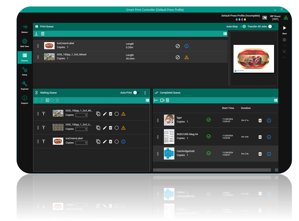
A highly requested feature in this release is the ability to export jobs from the Waiting and Completed queues for archiving and future use. This feature doesn’t just save the PDF file but also captures the entire job state.
In the Waiting and Completed queues, you’ll now find an Export Selected button. This allows you to export one or multiple jobs into a .jobs file, which includes the PDF file, the complete job state, and a JPEG thumbnail.
The .jobs format is designed for flexibility, enabling external systems to access the file and extract thumbnails or details about the job state as needed.
Additionally, a new Reimport button has been added to the Waiting queue. This lets you reimport previously exported jobs back into the queue, where they will return to the exact state they had in Smart Print Controller prior to export.
New tools for bulk job handling: simplify your workflow
Previously, managing jobs in the queues was limited to handling them individually. However, as the number of jobs increases, the need for efficient bulk operations becomes essential.
In this latest release, we’ve significantly enhanced the job-handling capabilities. You can now perform actions on multiple jobs simultaneously, including deleting, moving, exporting, importing, and setting the media for selected jobs. These updates make it easier and faster to manage large volumes of jobs, streamlining your workflow and saving valuable time.
Additionally, all these bulk job-handling functions are fully accessible via our OPC UA interface, providing seamless integration with external systems and enabling automated workflows.
Introducing the Service RIP: enhanced processing for SPC
In version 4.9, we introduced the Service RIP, a dedicated RIP designed not to drive the press but to provide additional processing capabilities for the Smart Print Controller. While the main RIPs handle the critical task of driving the printer, the Service RIP offers a range of supplementary services. For example, it can RIP pages to calculate a drop count for ink estimation, pre-RIP complex jobs in advance, generate soft proofs, and handle various other tasks.
The Service RIP operates through its own dedicated queue, allowing different functions within Smart Print Controller to use its processing power to produce RIPped output as needed, all without interrupting the workflow of the main RIPs.
Although the foundation for the Service RIP was introduced in version 4.9 and used to power the new Job Cost Estimation feature, there was a key limitation: the Service RIP could only be used when the main RIPs were remote.
In this latest release, that restriction has been lifted. You can now leverage the Service RIP even when the main RIP is on the same PC as the Smart Print Controller, providing greater flexibility and making it easier to maximize the available processing power.
Introducing the enhanced RIP Ahead feature: no more mode switching
The Smart Print Controller (SPC) has always included a RIP Ahead function, but in earlier versions, it came with several limitations. Operators had to switch the application into a different mode, choosing between RIP Direct or RIP Ahead. Once jobs were RIPped ahead, they could only be sent to the printer using Screen Direct. This workflow was originally designed to pre-rip complex jobs overnight for printing the next day. However, while printing pre-ripped jobs, it wasn’t possible to RIP other jobs directly to the press.
Additionally, because the main RIPs were busy driving the press, it wasn’t feasible to RIP Ahead while the press was running. This made the system workable but far from ideal, especially for environments requiring efficient multitasking.
In this release, we’ve completely reimagined the RIP Ahead function, introducing more flexibility and an optimized workflow. Operators no longer need to switch between modes—the software remains in RIP Direct mode at all times.
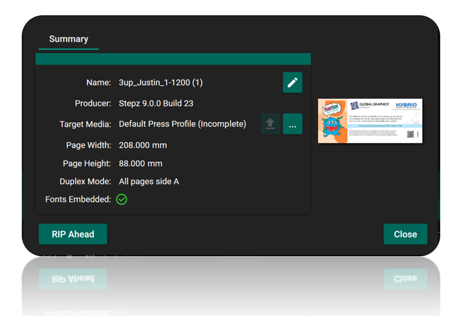
Here’s how it works: using the performance traffic light system, if a job is flagged red (indicating it’s too complex to RIP directly to the press without adjustments), the operator can open the job’s Details Panel and trigger a RIP Ahead for that specific job. The Service RIP pre-processes all pages and separations in the job and embeds the RIPped data within it. A small “R” appears under the job to signal it contains RIPped data.
This new functionality enables both RIP Direct and RIP Ahead jobs to coexist in the print queue. When a RIPped-ahead job is picked up by the RIP server, the stored rasters are used instead of re-ripping the job. Crucially, the Service RIP allows operators to RIP Ahead even while the press is running, as it works independently of the main RIPs driving the press.
With this enhanced system, there’s no need for mode-switching, and complex jobs can be efficiently processed and queued alongside simpler ones. Now, when you see a red traffic light, simply RIP Ahead for a smoother and more productive workflow.
Introducing Always-On traffic lights for job performance monitoring
Performance traffic lights are now always visible in the interface. Previously, this system was only available if you enabled our AI-powered estimation and autotune functionality, as the traffic lights relied on estimates generated by this technology.
However, with the introduction of RIP Ahead and CPIM (Cache Pages in Memory) modes, we can now guarantee press-speed performance for certain types of jobs. As a result, the traffic light system will display even if you haven’t enabled the performance technology.
Here’s how it works:
- A green traffic light indicates that the job has either been RIPped Ahead or will fit in memory, and you’ve requested multiple copies (CPIM). In these cases, we can confidently calculate that the job will run fast enough to meet press requirements.
- A clear traffic light means that we can’t guarantee the job will RIP at press speed, as no additional performance insights are available.
If you choose to enable the AI-powered performance technology, you’ll unlock the full traffic light system with green, amber, and red indicators, providing detailed predictions on job performance based on advanced estimations.
With this update, performance traffic lights are now more versatile and accessible, ensuring operators can monitor and optimize their workflows regardless of their chosen settings.
Smart Media Manager opens up with OPC UA technology
Finally, we’ve added an OPC UA interface to Smart Media Manager (SMM). The Smart Print Controller uses files called Smart Media Definitions (.smd) to optimize quality for any media type. These files contain a wide range of settings, including ICC profiles, screen tiles, drop transitions, RIP settings, and more. Smart Media Manager simplifies the creation of these SMDs, making it easy to configure media for optimal performance.
While Smart Media Manager is fully brandable—and some of our partners use it in this way—we’ve received requests for an option that can be integrated into custom user interfaces or workflows. In response, this version introduces the OPC UA interface to SMM, exposing many of its functions for seamless integration into your own interface or to enable the creation of entirely new workflows.
Although not all functions are supported yet, the most used features are now accessible, giving you greater flexibility and control over how you manage and optimize media within your system.
You can see the full list of improvements here: SmartDFE v4.10 Release Notes
Further reading:
Be the first to receive our software release updates, blog posts, company and product news. Why not subscribe to our newsletter? Subscribe here