
Applications Specialist Nigel Wild continues his series about color. In this post, he discusses why it’s so important to measure it.
We’ve talked about color spaces before — CMYK, RGB, LAB — the usual suspects. But today, let’s dive into something absolutely vital for anyone who works with color professionally: you need to measure it. Not just guess it.
Let’s talk LAB (No, not the dog)
LAB values are special because they’re device independent. It doesn’t matter if you’re printing on a flexo press, inkjet, gravure, or screen — as long as your devices are properly calibrated to the same standard, a specific color should give you the same LAB values.
That’s the whole point: what you measure should match, regardless of how it’s produced.
I hear you saying: “But I’ve got a great eye for color!” Sure, and if you’ve got superhero powers and can spot Delta E differences below 1.0 without breaking a sweat, go for it. Just promise us you’ll confirm it with an instrument. Because here’s the thing…your eyes lie (but it’s not your fault). Take a look at this famous illusion by Edward H. Adelson, MIT (1995):
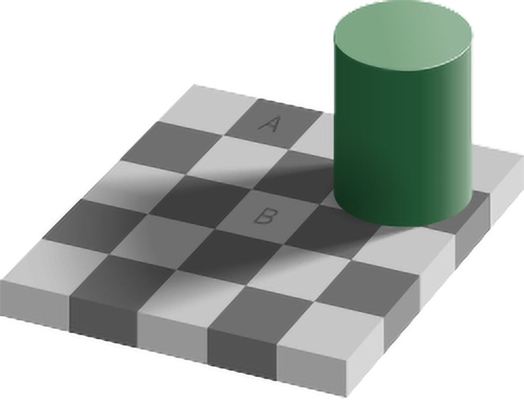
Look at squares A and B.
Ask yourself — is square A darker than square B?
If you said yes, congratulations — you’re honest and normal. You’re also wrong. Totally wrong. But don’t worry — we all are sometimes. If you said no, you’ve either seen this before, or you’re a robot, because A and B are the exact same color. Mind. Blown.
Still don’t believe it? Cut the squares out and see what happens:
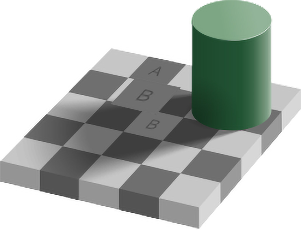
Proof they are the same. Or better yet, watch as the illusion is broken down layer by layer in this animation:
This illusion only messes with luminance — just one channel of perception. Imagine the chaos once we throw in chroma–saturation, and hue!
So what’s the point? Color perception isn’t just flawed — it’s emotional, subjective, and wildly inconsistent.
People perceive colors in different ways. Add lighting, substrate, ink type, and press condition into the mix, and things get messy fast. Which is why arguments over color are common… and often unwinnable without hard data.
Want to get color right?
Then measure it – with a calibrated instrument, for example a spectrophotometer, in a device-independent space (like LAB), and use consistent settings (illuminant, observer angle geometry, UVcut M settings) when comparing like for like. That’s the only way you can:
- Accurately compare colors
- Calculate color differences (∆E)
- Adjust your output device to hit the target
Bottom line
The bottom line is that color is not a matter of opinion, it’s a matter of measurement.
There’s one more thing that often gets overlooked: measurement accuracy. Even with the best tools, your results are only as good as your technique. There are a few tips and tricks that can help you get it right the first time — but I’ll save that for my next post.
In the meantime…
💬 Drop a comment below — I’m always curious how others explain color in simpler ways, especially when it’s a topic that can leave your head spinning faster than a Pantone fan deck.
👍 Like, follow, subscribe — whatever platform you’re on, go ahead and press that button. It makes my boss smile and gives me a reason to keep writing these instead of answering more emails.
Until next time — measure well, print beautifully.
About the author

Nigel Wild is an applications specialist and responsible for workflow in SmartDFE™. He joined Global Graphics Software in 2022 after working in workflow automation for many years. Nigel has worked in the printing industry in most areas, from prepress, printing, supplying services, hardware and software solutions.
Read more
- Everything you need to know about color gamut
- Everything you need to know about color – understanding color space
- Spot colors: their crucial role in the world of printing
- Everything you need to know about color – Delta E
Be the first to receive our blog posts, news updates and product news. Why not subscribe to our monthly newsletter? Subscribe here