
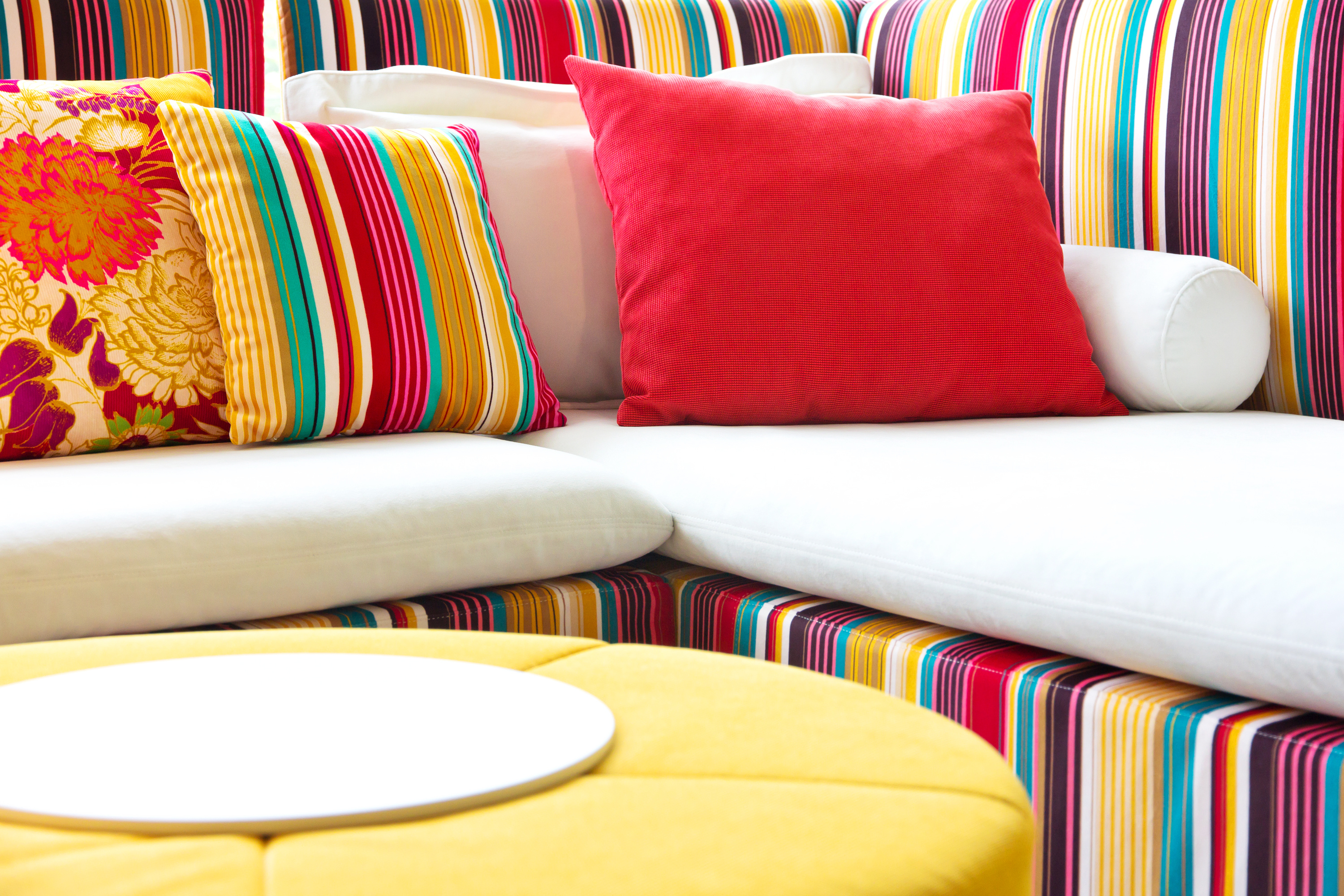
With fewer design limitations, a faster turnaround, no minimum run length and higher margins (not to mention reduced use of power and water, and of pollution), it’s not surprising that the digitally printed textile market is growing.1 Inkjet has certainly made textile design and printing much more flexible than screen printing – and that goes for everybody involved, from the designer through the printing company, to the buyer.
But printing textiles on inkjet doesn’t come without its challenges: as a software provider focusing on print quality issues, we often hear from print service providers who can only digitally print two thirds of the jobs they receive because they would not be paid for the quality they could achieve on the others.
Shade or color variation is a common problem. It’s not new in digital printing (it’s always been an issue for screen-printed and dyed textiles as well) and is usually managed by providing a shade band, which printer operators refer to, to check allowable color variations between pieces.
But, unlike screen-printing or dyeing, the color variation on an inkjet press can be visible over a small distance, just a few centimeters, and this results in visible bands across the output. Banding describes features that tend to be 1 – 10 cm across and they’re often caused by variation of inkjet pressure or voltage differences within the head, which typically results in a frown or smile shape. We also see a certain amount of manufacturing variation between heads so that one may print lighter or darker than the head next to it in a print bar. Some types of heads can also wear in use, which can result in less regular banding that can change over time. This means that large areas which should be flat color may not be.
When such a variation occurs it can greatly complicate a lot of post-print steps, especially if you need to put more than one piece of textile together, either in sewing or use (such as a pair of curtains). If that’s the case, then a significant difference may be unacceptable and your printing rejected by your buyer. Ultimately this leads to print service providers rejecting jobs, because they know their digital press can’t handle printing those tricky flat tints or smooth tones.
What can you do about it?
The first thing many companies do to try to overcome this banding is to adjust the voltage to the inkjet head, but this is often time-consuming and expensive because it requires an expert technician. A better alternative is to make the correction in software, which is a more cost-effective and faster solution. It means it can be automated and can act at a much finer granularity, so printing is more accurate. There’s no need to mess with controls that could damage the press, and printing companies themselves can make corrections without the vendor sending a technician on-site.
Our solution at Global Graphics Software for improving banding is PrintFlat™. It corrects tonality to hide banding based on measurements from the press. It adjusts every nozzle separately and doesn’t need a specialist engineer to make press adjustments. PrintFlat can be integrated into different digital front ends, using a variety of RIPs, including Caldera and Colorgate and, not to mention, our own Harlequin RIP®.
Over the years of working with many press manufacturers we’ve discovered that many technical issues and solutions are common across different sectors, including transactional, wide-format, commercial, labels and packaging, and industrial, including ceramics, wall coverings, flooring and of course textiles. That means that we already have years of experience in correcting for banding. Using PrintFlat in your press means print service providers can now take on those jobs they would normally reject.
To learn more about how to eliminate shade and color variation when printing on an inkjet press, listen to Global Graphics Software’s CTO Martin Bailey’s talk for FESPA 2020:
“New techniques to eliminate in-lot shade variation when printing textiles with inkjet.”
Or visit the PrintFlat website: https://www.printflat.com/
Further reading:
- What causes banding in inkjet? (And the smart software solution to fix it.)
- Streaks and Banding: Measuring macro uniformity in the context of optimization processes for inkjet printing
To be the first to receive our blog posts, news updates and product news why not subscribe to our monthly newsletter? Subscribe here
Follow us on LinkedIn and Twitter
_______________________________
- Digitally printed textiles are estimated to be between 2% – 5% of the total printed textiles market. Estimated at $146.5 billion in 2018 by Grand View Research