
By Martin Bailey, CTO, Global Graphics Software
In several sectors of the print market it is common practice to convert text to outlines upstream of a RIP, on the grounds that it’s then impossible for the wrong glyph to be printed. This is normal, for instance, in much of the label and packaging industry, especially when there is very robust regulation in place, such as in pharmaceuticals.
Every page description language defines “scan conversion” rules that specify which pixels should be marked when a graphic is painted onto a page; these build on the concept of “pixel touching”, specifying exactly when a vector shape counts as touching a pixel and therefore marking it.
When you’re using PDF (or PostScript, before that) the scan conversion rules are different for text specified using live fonts and for vector shapes. If you started with live text and then converted it to outlines then you have switched from using the text scan conversion rules to using the vector graphic rules. That has always meant that text converted to outlines tends to render slightly heavier than text using live fonts. And the smaller the text is, the more the weight difference becomes apparent.
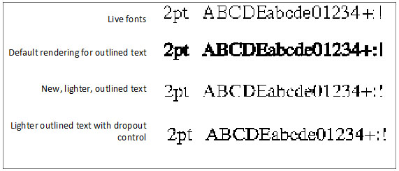
In Fig 1 you can see this difference very clearly for very small Western text rendered at 2pt and 600dpi, still a common resolution for digital printers and presses. The top line shows text using live fonts, and the second line shows the PDF scan conversion rule for a vector fill. Note that at 2pt the RIP only has about 12 pixels for the height of an upper-case glyph.
In early 2018 we added a new scan conversion rule for vector fills alongside our pre-existing rules in the Harlequin RIP. The intention was to make it possible to emulate the much lighter output that Esko’s FlexRIPs produce. Unfortunately, it also tended to emulate the ability for very fine structures, especially fine horizontal strokes in small text, to disappear. You can see this in the third row of text in Fig 1.
This is obviously not an optimal solution, so we continued our development, and have now extended the original solution with what is called “dropout control”. This prevents very fine sections of a vector fill “dropping out” when they manage to fall on the page in such a way that they don’t cross the locations in the pixels that would trigger anything being marked. You can see the effect of this in the bottom line in Fig 1.
Light rendering with dropout control was delivered to our OEM partners in late 2018 under the name RenderAccurate.
Even this optimized output won’t exactly match the output of live fonts, because the fonts themselves often include hints to the rendering engine, designed to ensure maximum legibility and conformance to the font designer’s vision. These hints can, for instance, ensure that vertical stems are the same width in all glyphs, or that the curved base of a glyph will extend slightly below the baseline to make it visually balance with glyphs with flat bases that sit on the baseline. Those hints were discarded when the text was converted to an outline, and so can’t be used any more. But the new scan conversion algorithm certainly strikes a good balance between matching the weight of live fonts and maintaining legibility.
The effect is visible in very small text in Latin fonts, as shown in Fig 1, but the impact is often masked by the physical effects of printing. And Latin glyphs tend to be relatively simple, so that the human eye and brain are pretty good at filling in the missing segments without too much impact on legibility or comprehension.
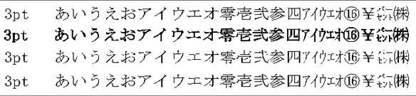
On the other hand, Chinese, Japanese and Korean (CJK) fonts are often more complex, with the result that the effect is visible at larger point sizes. And the meaning can be obscured or altered much more easily if strokes are missing. Fig 2 illustrates the same effects on Japanese text at 3pt, rendered at 600dpi. At this size and resolution, the RIP has about 22 pixels for the height of each glyph.
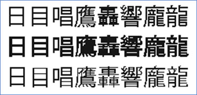
The glyphs shown in FIG 2 are complex compared to Western scripts, but any solution that will be used with CJK scripts must obviously also be proven with the most complex character shapes, such as the Kanji in FIG 3. Some of these have so many horizontal strokes that they simply cannot be rendered with fewer than 22 device pixels vertically and require more than that for reliable rendering. The sample in this figure is rendered at with around 27 pixels for the height of each glyph.
This article has deliberately used very small text sizes as examples, simply because the effects are easier to see. But the same issues arise at larger sizes as well, albeit more rarely.
On the other hand, it is precisely because the issue appears more rarely, and because the effects are less immediately noticeable, that makes the risk of dropping strokes so dangerous. It’s perfectly possible that an occasional missing stroke, perhaps in an unusually light font, may go unnoticed in process control. And that might result in a print that disappoints a brand owner, or even that fails a regulatory check, after the label has been applied or the carton converted and filled, or even after the product being shipped.
So, when a brand demands lighter rendering of pre-outlined fonts, make sure you’re safe by also using dropout control in your RIP!