

Spot colors play a crucial role in the world of printing, adding vibrancy and consistency to the reproduction of specific hues. In this post, Tom Mooney, product manager at Global Graphics Software and responsible for quality in SmartDFE™, explains the processes of using spot colors in various printing methods.
Precision in offset presses
On an Offset Press, meticulous attention is given to each color station. The printer cleans down a station, mixes the ink to match the desired color (often a brand color, such as Coca-Cola Red), and prints with a dedicated plate. These spot colors are usually solid, without shades, and are integral for brand identity. Using this method, the printer can achieve consistent results by reusing the same ink mix across multiple print runs.
Specialist printers capable of formulating unique ink blends can extend the color gamut beyond the limitations of standard Cyan, Magenta, Yellow, and Black (CMYK) inks. While CMYK can be employed for spot colors, it’s common to use dedicated ink mixes for accuracy, especially when dealing with brand-specific colors.

PDFs: designers have the power
In the digital realm, designers wield the power to select and define colors with precision. Whether it’s a recognizable brand shade like Coca-Cola Red or a custom supermarket green, designers can use Pantone® or other reference libraries. These libraries may include ink mixes, ensuring consistent color reproduction.

However, when creating elaborate designs with numerous Pantones, the practicality of printing each color separately diminishes. Printers often convert these spot colors to process colors (CMYK) to streamline the printing process, avoiding the need for multiple plates and runs.
Adapting to the digital canvas
Digital presses predominantly operate in CMYK or extended gamut, occasionally incorporating additional colors like orange, violet or green. While some digital presses may allow for spot colors, the constraints of inkjet technology make them less flexible in ink formulation compared to traditional offset printing.
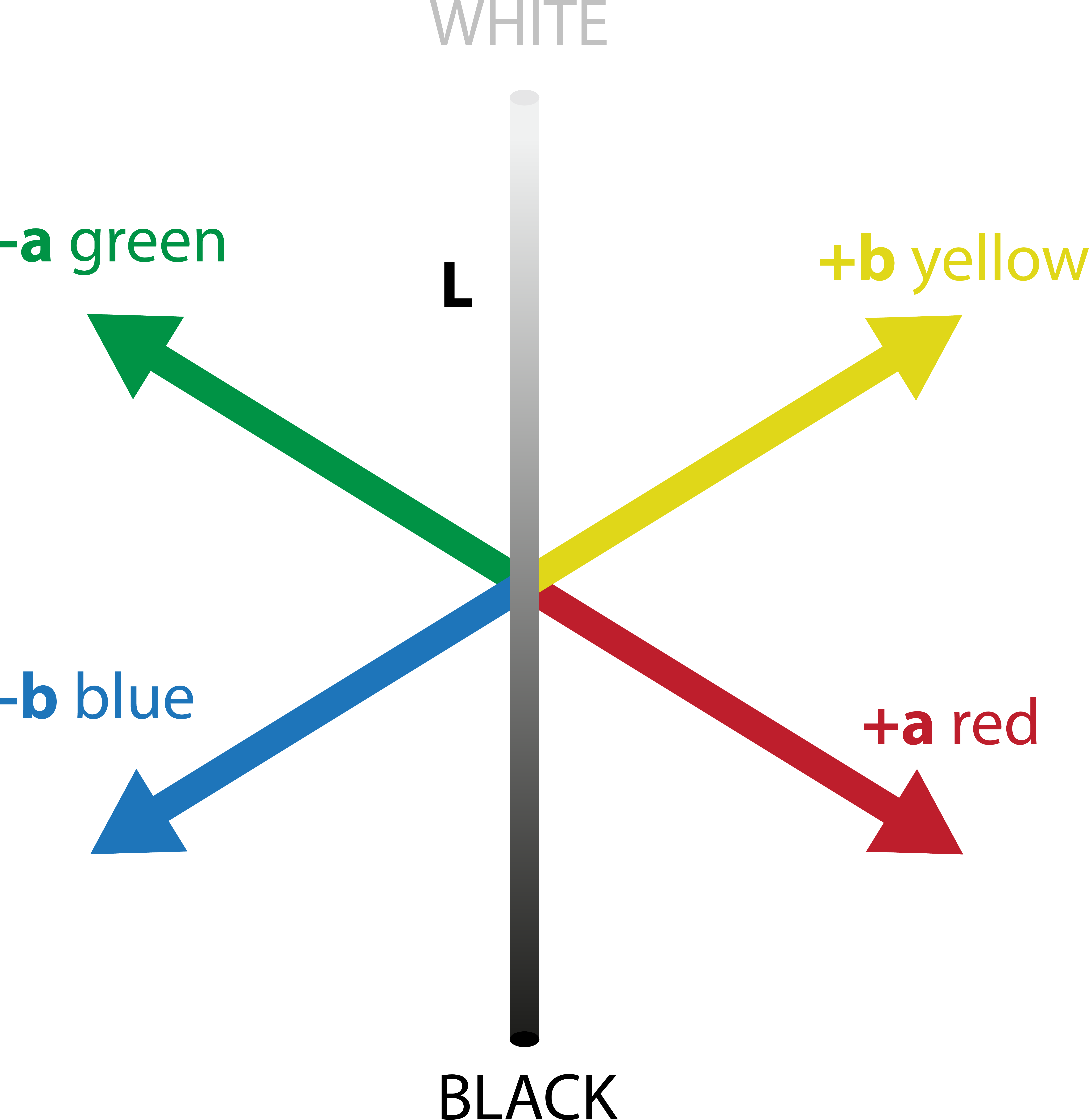
Ink mixes are device specific; they are a mixture of inks that in those proportions will give a certain color on a certain press. If the inks, media, press and operating conditions all conform to a standard, then you will get a repeatable color. If there is a change from this standard in any way, then there will be a difference in color. This change may just be temperature and humidity or more significant, such as a change of ink or media. This will mean that there must be some kind of color correction or “tweak” on the press. This is rarely a problem with traditional presses such as offset, flexo and gravure, but in the digital world there is a wide range of ink formulations and printhead manufacturers with no real industry-adopted standard for digital inkjet. This “tweaking” can be avoided by defining a color in a device-independent space, such as CIELAB or CIE L*a*b*.1
Using the CIELAB color space, the press operator can create an ICC profile2 that matches the ink mix values on the press to the L*a*b* values. This allows different presses to match the colors that the designer specified. Or better still, the spot colors can be defined as spectral data in CxF/X4 format. This allows a color management system to predict colors under different lighting conditions and even with different media.
Digital print jobs still receive PDFs, and spot colors are converted to process colors through ICC profiles. The challenge arises when dealing with “Pure Colors,” where careful color management is required to prevent undesirable artifacts like digital “scum” dots. This is the presence of a small number of dots of another color that the color management system has introduced to make the spot color colorimetrically accurate, but it looks odd, and the eye picks up on the dots which look “dirty”. Printers have learnt that these “dirty” colors look better “pure”, with the “scum” dots removed. Spot editing tools become essential for operators to fine-tune colors and maintain consistency across reprints.
Managing libraries and devices
For spot colors, especially Pantones, the choice between CMYK and L*a*b* values is crucial. L*a*b* values provide device-independent color definitions, while CMYK values are device-dependent. Many digital presses have extended gamut inks, and a brand color that may be out of gamut in CMYK could be in gamut with the addition of these inks. Just to define colors in CMYK would artificially limit the colors that are achievable on the press. Tools that can edit in both L*a*b*, with Out of Gamut checking, and using the extended gamut inks are essential. Matching colors across a mixed fleet of digital printers requires a Lab-based workflow with seamless conversion between different devices to ensure consistent results.
Achieving precise colors often relies on skilled print operators, however, there is a growing shortage of these experts. This is especially true in industries integrating print into broader manufacturing, where non-specialists take on printing tasks. At Global Graphics Software we have integrated this expertise into the software. The Smart Quality technology in SmartDFE combines advanced technologies like ColorLogic, ScreenPro™ and PrintFlat™ into a user-friendly system, making it easier for any operator to achieve excellent print quality.
About the author

With a BSc in Printing and an MSc in Digital Imaging, Tom has worked in the inkjet printing industry in sales, business development and software for the last 30 years. Most recently at Global Graphics he has developed screening, color and workflow products and is currently responsible for quality in the company’s SmartDFE™ Digital Front End.
Be the first to receive our blog posts, news updates and product news. Why not subscribe to our monthly newsletter? Subscribe here
Notes
- CIELAB or CIE L*a*b*
The Commission Internationale de l’Eclairage has defined a Color Appearance model. It has become the basis of a color measurement standard.
L* (Luminance – how bright or dark a colour is)
a* (how green/red a colour is)
b* (how yellow/blue a colour is).
This gives a coordinate of a color. The color can also be described as the:
L* (Luminance)
C* the Chroma (how colorful the color is) and the
h° Hue angle (what color the color is).
2. ICC Profiles
An ICC profile is a set of data that characterizes a color input or output device, or a color space, according to standards set by the International Color Consortium (ICC).