Advertising is everywhere, but it might be a new form that captures the imagination: In July 2018 an artist was commissioned by Spotify to create a picture out of a field of crops (Spotify, 2018). This was a painstaking labor which consisted of 34 days in a row of work. It also used a large amount of weed killer, which can have a negative impact on the environment.
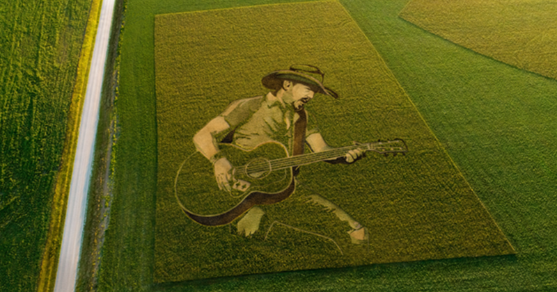
When our software developers take time out in The Shed, our maker space where we try out new technologies and hardware, we never quite know what ideas will surface. But thanks to one software developer’s ingenious creativity we’re now the proud owners of a patent for a method that uses seeds instead of ink to create images.
Former Global Graphics’ software developer Andy Cardy invented the method from a process we use in the printing industry known as screening or half toning. Screening takes a source image with a wide color gamut and creates an output raster format which determines the position and size of droplets of ink required by the printer to recreate the original image.
With this new patent, instead of the output raster format controlling droplets of ink on a printer, it determines:
which plant or seed is planted to create a color reproduction of the original image, allowing for variable space in the reproduction, for example larger drop sizes could represent large foliage plants;
how deep the seed is planted, for variable images throughout the growing season;
where the seed is planted;
and how many seeds are planted.
The screening process and output also takes into account variables such as soil color and its properties. By incorporating these variables, the method guarantees that the final plant-based reproduction appears visually accurate, accounting for the natural hues that may appear between plants, just like we would consider the substrate in the printing industry.
The approach could be suitable for a range of applications including large-scale advertisements, especially on busy flight paths, public artwork and even fallow farmland, where wild bird seed or nectar and pollen sources could be sown in an advertisement image, benefiting both wildlife and the farmer.
Aside from advertising, this technology could be used in place of any activity that would use weed killer or the ploughing of unwanted crops. This could include the methods used to create maize mazes, which are becoming a popular supplemental income option for farmers. The current method of creation is to sow the whole field, then destroy the crop that’s no longer required, tracked by GPS. Instead, this technology would simply avoid planting seeds where they are not required.
Of course, we know from our own gardening experience that things don’t always grow as planned, but there’s a chance we could say goodbye to hours of painstaking work to create that advertisement in a field of crops and hello to a new wave of agricultural artistry!
Be the first to receive our blog posts, news updates and product news. Why not subscribe to our monthly newsletter? Subscribe here
Halftone screening, also sometimes called halftoning, screening or dithering, is a technique to reliably produce optical illusions that fool the eye into seeing tones and colors that are not actually present on the printed matter.
Most printing technologies are not capable of printing a significant number of different levels for any single color. Offset and flexo presses and some inkjet presses can only place ink or no ink. Halftone screening is a method to make it look as if many more levels of gray are visible in the print by laying down ink in some areas and not in others, and using such a small pattern of dots that the individual dots cannot be seen at normal viewing distance.
Conventional screening, for offset and flexo presses, breaks a continuous tone black and white image into a series of dots of varying sizes and places these dots in a rigid grid pattern. Smaller dots give lighter tones and the dot sizes within the grid are increased in size to give progressively darker shades until the dots grow so large that they tile with adjacent dots to form a solid of maximum density (100%). But this approach is mainly because those presses cannot print single pixels or very small groups, and it introduces other challenges, such as moiré between colorants and reduces the amount of detail that can be reproduced.
Most inkjet presses can print even single dots on their own and produce a fairly uniform tone from them. They can therefore use dispersed screens, sometimes called FM or stochastic halftones.
A simple halftone screen.
A dispersed screen uses dots that are all (more or less) the same size, but the distance between them is varied to give lighter or darker tones. There is no regular grid placement, in fact the placement is more or less randomized (which is what the word ‘stochastic’ means), but truly random placement leads to a very ‘noisy’ result with uneven tonality, so the placement algorithms are carefully set to avoid this.
Inkjet is being used more and more in labels, packaging, photo finishing and industrial print, all of which often use more than four inks, so the fact that a dispersed screen avoids moiré problems is also very helpful.
Dispersed screening can retain more detail and tonal subtlety than conventional screening can at the same resolution. This makes such screens particularly relevant to single-pass inkjet presses, which tend to have lower resolutions than the imaging methods used on, say, offset lithography. An AM screen at 600 dots per inch (dpi) would be very visible from a reading distance of less than a meter or so, while an FM screen can use dots that are sufficiently small that they produce the optical illusion that there are no dots at all, just smooth tones. Many inkjet presses are now stepping up to 1200dpi, but that’s still lower resolution than a lot of offset and flexo printing.
This blog post has concentrated on binary screening for simplicity. Many inkjet presses can place different amounts of ink at a single location (often described as using different drop sizes or more than one bit per pixel), and therefore require multi-level screening. And inkjet presses often also benefit from halftone patterns that are more structured than FM screens, but that don’t cluster into discrete dots in the same way as AM screens.
The above is an excerpt from our latest white paper: How to mitigate artifacts in high-speed inkjet printing. Download the white paper here.
They say a problem shared is a problem halved. Well, two weeks on from our launch of our Advanced Inkjet Screens it’s been gratifying to see how much the discussion of inkjet output quality has resonated among the press vendor community.
Advanced Inkjet Screens are standard in the ScreenPro screening engine
Just in case you missed it, we’ve introduced a set of screens that mitigate the most common artifacts that occur in inkjet printing, particularly in single-pass inkjet but also in scanning heads. Those of you who’ve attended Martin Bailey’s presentations at the InkJet Conference ( The IJC) will know that we’ve been building up to making these screens available for some time. And we’ve worked with a range of industry partners who’ve approached us for help because they’ve struggled to resolve problems with streaking and orange peel effect on their own.
Coalescence on inkjet is directional and leads to visible streaks.
Well, now Advanced Inkjet Screens are available as standard screens that are applied by our ScreenPro screening engine. They can be used in any workflow with any RIP that allows access to unscreened raster data, so that’s any Adobe PDF RIP including Esko. Vendors can replace their existing screening engine with ScreenPro to immediately benefit from improved quality, not to mention the high data rates achievable. We’ve seen huge improvements in labels and packaging workflows. Advanced Inkjet Screens are effective with all the major inkjet printheads and combinations of electronics. They work at any device resolution with any ink technology.
Why does a halftone in software work so well? Halftones create an optical illusion depending on how you place the dots. Streaking or graining on both wettable and non-absorbent substrates can be corrected. Why does this work in software so well? Halftoning controls precisely where you place the dots. It just goes to show that the assumption that everything needs to be fixed in hardware is false. We’ve published a white paper if you’re interested in finding out more.
The Mirror screen mitigates the orange peel effect common when printing onto tin cans, plastics, or flexible packaging
When you speak frequently at industry events as I do, you can tell what resonates with your audience. So, it was very gratifying to experience the collective nodding of heads at the Inkjet Conference in Neuss, Dusseldorf this week.
I gave an on update mitigating texture artifacts on inkjet presses using halftone screens.
You see, it turns out that there is more commonality between inkjet presses than we previously thought. I’m not saying that there is no need for a custom approach, because there will always be presses with specific characteristics that will need addressing through services like our BreakThrough engineering service.
What I am saying is that we’ve discovered that what matters most is the media. And it gives rise to two distinct types of behavior.
On reasonably absorbent and/or wettable media drops tend to coalesce on the substrate surface in the direction of the substrate, causing visible streaking especially in mid and three-quarter tones. These issues are amenable to correction in a half tone.
Whereas on non-absorbent, poorly wettable media such as flexible plastics or metal, prints are characterized by a mottle effect that looks a bit like orange peel.
.
This effect seems to be triggered by ink shrinkage during cure. This can be corrected with a halftone with specially designed characteristics. We have one in test on real presses at the moment.
So it won’t be long now before we introduce two advanced screens for inkjet that will greatly improve quality on the majority of inkjet presses. One to counteract streaking. The other to counteract the orange peel effect. And the next project is to address non-uniformity across the web. Fixing that in software gives you the granularity to address every nozzle separately on any head/ electronics.
And for those presses aforementioned with unique properties that need special tuning? Our Chameleon design tools can create unique halftones for these cases.
There’s been a lot of emphasis in the industry recently on perceived resolution. I’m sure you will have come across the phrase from major vendors:
“The Xerox Rialto 900 (…) offers 1,000 dpi perceived resolution for high quality output.”
Oce Vaior Print i300: “The multilevel dot modulation in combination with 600x600dpi resolution boosts the print quality of image elements and shadings to perceived 1200 dpi.”
But what is resolution anyway, and is it the only thing we need to worry about to ensure high quality output?
How we perceive resolution has changed over the years. For conventional print and first generation digital presses (except for wide format), resolution was two dimensional (across and along the media). More recently, inkjet presses (and some toner) can place different amounts of colorant at each location on the substrate, using greyscale heads, multiple passes with the same head, or multiple heads imaging at the same location. This means that resolution has effectively become 3D: not only along and across the media, but also in the amount of colorant applied at any single pixel position.
At Global Graphics we call this “multi-level output”, compared to the “binary” output where each pixel can either be coloured or not, with no intermediate steps.
Resolution? Or addressability and droplet size? As print geeks know well, press resolution has very little to do with resolving power, it is really a marketing simplification to use the word ‘resolution’ for ‘addressability’ – eg at 600 dpi, each addressable pixel is 1/600” from its neighbours. The detail that can be displayed is a factor of droplet size as well as addressability; as droplets get bigger each one covers more than just a single (square!) pixel on the media, so less fine detail is retained.
Droplet placement accuracy also comes into play. In a perfect world we would have a regular grid of droplets, but in practice we don’t usually get one. The variation in separation between droplets can lead to coalescing, mottling or streaking on some substrates, especially on UV inkjet presses, but it can occur on aqueous as well.
Addressability and droplet size affect the rendering of small type and other high-contrast fine detail. Droplet placement accuracy affects texture of final print. So we still don’t have a clear metric for “perceived resolution” …
What about resolution and bit depth? Using multi-level output can produce smoother rendering of images and other graphics with gradual tone or colour changes than binary output at the same resolution can achieve.
Multi-level output, shown left, can produce smoother rendering of images than binary output, shown right, at the same resolution.
But nozzle redundancy is also vital: In a single pass press, with a page-wide array, a single blocked nozzle will leave a white line down the substrate unless something is built in to fix that, such as nozzle redundancy. And that redundancy must use up some of the press’ capability to use multiple nozzles in the same location for multi-level output, so 1200 dpi nozzles often doesn’t mean 1200 dpi addressability on the substrate.
And sometimes each nozzle can only deliver one droplet size; sometimes it can deliver a variety of sizes.
So what’s the real quality that these presses are capable of? We need a lot of information to really understand what’s going on: dpi across and along the media, number of nozzles imaging any single pixel, droplet sizes available from that nozzle, proportion of nozzles used for redundancy … I don’t think I’ve ever seen a press vendor’s public specification that gives us all the information we want.
Can we even say, simplistically, that higher resolution and bit depth are good? If everything else is equal then yes, in many cases, except that you can push either too far. On an aqueous inkjet, higher resolutions really need smaller highlight droplets; smaller lone droplets tend to disappear into some media and can lead to loss of extreme highlights on the output. Interestingly you end up with output that looks remarkably close to the way flexo loses those same highlights!
And you also need to remember that higher addressability means high computational requirements, and more computations mean more expensive DFEs, higher running costs, maybe even less green … (a faster RIP can offset this, of course!) It also makes the press more expensive, and harder to run as fast.
And what’s the impact on quality? There are other factors other than bit depth, addressability and droplet size and placement which affect the final result, for example:
Items affecting ink spread or movement on the substrate such as paper smoothness, absorbency, coatings, ink viscosity and surface tension;
Movement of the colorant into the substrate, reducing the capability of showing very small detail or saturated colours.
Registration
Halftone screening
Colour management, including ink limitation and reduction
So the ‘virtual’, mathematical discussion of resolution and droplet size are is certainly not the only factor in determining the quality of output. Quality arises from a complex mix of heads, electronics, wave forms, inks, media, resolution, registration, bit depth and half-toning etc. We don’t have a good way to provide a single, understandable quality metric to sum it all up. ISO DTS 15311-1 is defining testing and reporting methodologies in this area, although it still doesn’t provide a simple quality metric.
So what’s the answer? We just don’t have a single number that sums up the quality capability of a digital press at the moment. But then simply reporting ‘resolution’ has never really fulfilled that role in the past for binary systems, from imagesetters to platesetters to office printers … to digital cameras. So perhaps we shouldn’t be too disappointed.
What should you do when a vendor reports “perceived resolution”? I’d suggest that you take it as an indication of the level in the marketplace that the vendor is intending to address … and then draw your own conclusions based on print samples.
If you’re looking to buy a press, have the vendor:
Print samples on the media and at the speed that you expect to use
Use a variety of graphical constructs to explore press behaviour:
Flat tints at a range of tones and colours
Smooth graduations, including some long ones all the way to white
Photographic images, including high and low key, soft-focus and sharp detail
Fine vector detail such as small serif and sans serif text
If you’re already running a press do the same. Each technology has different strengths and weaknesses; you may even need multiple presses to address all work in your particular target sector. The key thing is to understand what your presses are good at, and what to avoid, and then to work with your customers to achieve the best possible result … and to set expectations appropriately in advance.
If you’re a press vendor, talk to us about how Global Graphics’ multi-level screening technologies can maximise the quality and the value of your hardware.
Readabout our latest advances in screening, presented at the Inkjet Conference, October 2015.
Making progress in half-tone screening technology – our samples are ready to display!
We’re really looking forward to the Inkjet Conference in Düsseldorf next week. Global Graphics’ CTO, Martin Bailey, will be speaking at the conference and focusing on the problems inkjet vendors have encountered when printing on high-speed inkjets, particularly with regard to optimum image quality and droplet placement.
With this in mind, for the last few months we’ve been working with a number of inkjet press manufacturers to develop entirely new half-tone screening technology for presses that can vary the amount of ink delivered in any one location on the media. We’ve just received our sample prints to show you at the Conference and we’re really pleased with the results – you can see the improvement immediately.
The samples show typical ‘before and after’ scenarios: The ‘before’ samples are quite noisy and show mottle and puddling; the ‘after’ samples, printed with Global Graphics screening technology, show much smoother gradients where we manage the transition of droplet size in multi-level heads.
We have also prepared sample prints showing what the output looks like with no tuning on: They show noise and steps in gradients for multi-level output, then we demonstrate what happens when we use transition points of drop size when using inks such as white, orange and violet in the colour spectrum.
Look out for Martin at the Conference and drop by our table in the IJC Networking Arena to see the prints for yourself.
If you are interested in the benefits of half-tone screening on high-speed inkjets and would like to join our research programme, watch our video here for more information: https://www.youtube.com/watch?v=WNrSbb46efg.