It’s great to be back in Lucerne this week for Hunkeler Innovationdays 2023. We’ve had some interesting conversations and it’s been a good opportunity to catch up with friends and colleagues in the industry. But it’s not over yet! If you’re interested in adding a print subsystem to a smart factory or manufacturing line, come and talk to us on booth 45 to find out more about our SmartDFE™.
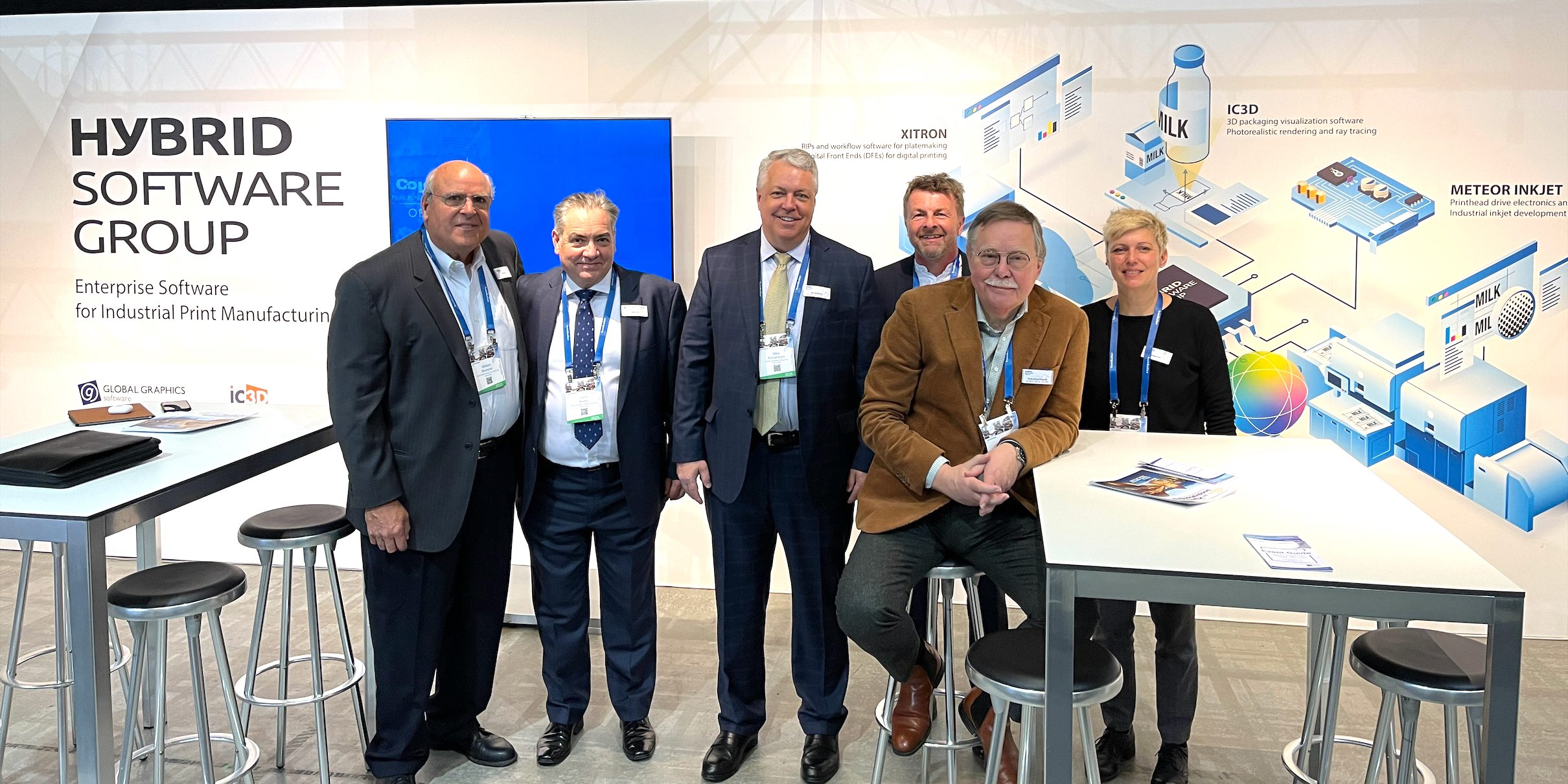
This year, we’re exhibiting on the Hybrid Software Group booth, alongside our sister companies: ColorLogic, HYBRID Software, iC3D, Meteor Inkjet and Xitron. In this recent interview with Inkish TV, our CEO, Mike Rottenborn, explained how we all work together and what you can expect to see from the Group at Hunkeler Innovationdays:
To be the first to receive our blog posts, news updates and product news why not subscribe to our monthly newsletter? Subscribe here
Follow us on LinkedIn, Twitter and YouTube