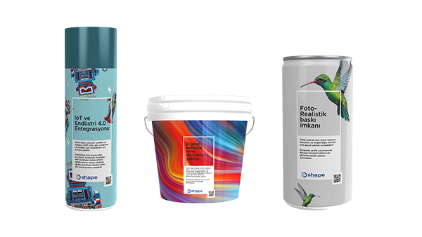
I’ve spoken to a lot of people about variable data printing and about what that means when a vendor builds a press or printing unit that must be able to handle variable data jobs at high speed. Over the years I’ve mentally defined several categories that such people fall into, based on the first question they ask:
“Variable data; what’s that?”
“Why should I care about variable data, nobody uses that in my industry?”
“I’ve heard of variable data and I think I need it, but what does that actually mean?”
“How do I turn on variable data optimization in Harlequin?”
And yes, unless you’re in a very specialised industry, people probably are using variable data. As an example, five years ago pundits in the label printing industry were saying that nobody was using variable data on those. Now it’s a rapidly growing area as brands realize how useful it can be and as the convergence of coding and marking with primary consumer graphics continues. If you’re a vendor designing and building a digital press your users will expect you to support variable data when you bring it to market; don’t get stuck with a DFE (digital front end) that can’t drive your shiny new press at engine speed when they try to print a variable job.
If you’re in category 3 then you’re in luck, we’ve just published a video to explain how variable data jobs are typically put together, and then how the DFE for a digital press deconstructs the pages again in order to optimize processing speed. It also talks about why that’s so important, especially as presses get faster every year. Watch it here:
And if you’re in category 4, drop us a line at info@globalgraphics.com, or, if you’re already a Harlequin OEM partner, our support team are ready and waiting for your questions.
This week WhatTheyThink launched its 2021 Technology Outlook – a resource guide designed for you to quickly learn about new innovations from industry analysts and thought leaders. It includes five technology focus areas: digital printing, labels & packaging, software & workflow, wide format & signage and textiles & apparel, and finishing.
As part of the software & workflow technology focus, David Zwang of WhatTheyThink chatted to our VP of products and services, Eric Worrall, about digital front ends (DFEs), the elements that comprise a DFE, and the recent launch of Global Graphics’ SmartDFE™, a complete single-source software and electronics stack that does everything from job creation through to printhead electronics, and a vital component in the smart factory of the future. Smart factories are designed to autonomously run the entire production process and this will include the print subsystems.
Watch it here:
Global Graphics Software’s Eric Worrall talking about Smart DFEs
To find out more about the smart factory and the smart digital front end, visit our website.
Be the first to receive our news updates and product news. Why not subscribe to our monthly newsletter? Subscribe here
We added support for native processing of PDF files to the Harlequin RIP® way back in 1997. When we started working on that support we somewhat naïvely assumed that we should implement the written specification and that all would be well. But it was obvious from the very first tests that we performed that we would need to do something a bit more intelligent because a large proportion of PDF files that had been supplied as suitable for production printing did not actually comply with the specification.
Launching a product that would reject many PDF files that could be accepted by other RIPs would be commercial suicide. The fact that, at the time, those other RIPs needed the PDF to be transformed into PostScript first didn’t change the business case.
Unfortunately a lot of PDF files are still being made that don’t comply with the standard, so over the almost a quarter of a century since first launching PDF support we’ve developed our own rules around what Harlequin should do with non-compliant files, and invested many decades of effort in test and development to accept non-compliant files from major applications.
The first rule that we put in place is that Harlequin is not a validation tool. A Harlequin RIP user will have PDF files to be printed, and Harlequin should render those files as long as we can have a high level of confidence that the pages will be rendered as expected.
In other words, we treat both compliance with the PDF standard and compatibility with major PDF creation tools as equally important … and supporting Harlequin RIP users in running profitable businesses as even more so!
The second rule is that silently rendering something incorrectly can be very bad, increasing costs if a reprint is required and causing a print buyer/brand to lose faith in a print service provider/converter. So Harlequin is written to require a reasonably high level of confidence that it can render the file as expected. If a developer opening up the internals of a PDF file couldn’t be sure how it was intended to be rendered then Harlequin should not be rendering it.
We’d expect most other vendors of PDF readers to apply similar logic in their products, and the evidence we’ve seen supports that expectation. The differences between how each product treats invalid PDF are the result of differences in the primary goal of each product, and therefore to the cost of output that is viewed as incorrect.
Consider a PDF viewer for general office or home use, running on a mobile device or PC. The business case for that viewer implies that the most important thing it has to do is to show as much of the information from a PDF file as possible, preferably without worrying the user with warnings or errors. It’s not usually going to be hugely important or costly if the formatting is slightly wrong. You could think of this as being at the opposite end of the scale from a RIP for production printing. In other words, the required level of confidence in accurately rendering the appearance of the page is much lower for the on-screen viewer.
You may have noticed that my description of a viewer could easily be applied to Adobe Reader or Acrobat Pro. Acrobat is also not written primarily as a validation tool, and it’s definitely not appropriate to assume that a PDF file complies with the standard just because it opens in Acrobat. Remember the Acrobat business case, and imagine what the average office user’s response would be if it would not open a significant proportion of PDF files because it flagged them as invalid!
For further reading about PDF documents and standards:
Martin Bailey, Distinguished Technologist, Global Graphics Software, is currently the primary UK expert to the ISO committees maintaining and developing PDF and PDF/VT and is the author of Full Speed Ahead: how to make variable data PDF files that won’t slow your digital press, a new guide offering advice to anyone with a stake in variable data printing including graphic designers, print buyers, composition developers and users.
Be the first to receive our news updates and product news. Why not subscribe to our monthly newsletter? Subscribe here
Banding, or non-uniformity, is a common problem in inkjet printing that can often result in print production downtime and loss of revenue. In this post, I’ll discuss the challenges printer OEMs and print service providers face when trying to reduce banding and provide an insight into the work we’ve been doing at Global Graphics Software to remove banding and streaking artifacts from the print output, enhancing print quality and raising productivity.
What causes banding in inkjet?
Inkjet printheads produce variable density output both across an individual printhead (known as the inkjet ‘smile’) and when comparing output from one printhead with another. The output from a printhead can also change with time, as the printhead wears or ages. Additionally, the overlapping stitch area between printheads in a single-pass printer, or between overlapping passes in a multi-pass printer, can also cause density variations. Such variable density becomes visible in the printed output as ‘banding’ and ‘stripes’, and means that it is not possible for print providers to digitally print jobs with certain image features (such as flat areas or gradients), or that they must sell the lower quality output produced at a significant discount.
Why is uniformity in inkjet a challenge?
Fixing banding or streaking in inkjet is not without its challenges:
In the printer design phase, the use of interlacing in the printing process can be effective at reducing banding and improving uniformity, but significantly impacts the speed and/or cost of the printer. This approach is especially undesirable in single-pass systems, where the only option to interlace is by doubling the quantity, and hence cost, of printheads in the printer.
Currently most OEMs attempt to correct uniformity issues with hardware solutions such as drive voltage tuning, but these give only limited improvement and are slow, complex and costly to implement. Most printheads have only limited voltage adjustment for banks of many nozzles together, or even the entire printhead as a whole, and do not allow adjustment of drive voltage for individual nozzles – such adjustment does not have the granularity necessary to really eliminate banding. Additionally, adjusting drive voltage to balance output density (drop volume), is undesirable as this is likely to negatively impact drop velocity, printing reliability (jetting stability) and even printhead lifetime. As the printer performance changes over time, and when printheads are replaced, service and support engineers must spend a significant amount of time onsite re-making these complex adjustments to achieve quality that is, at best, a compromise.
A solution in software
Global Graphics Software has been working with printer OEMs and print service providers to significantly enhance the quality of their inkjet output, one such company being Ellerhold AG, a leading poster printing house and press manufacturer in Germany.
Ellerhold wanted to enhance the printing quality of it’s large-format posters. Specifically, the printheads on its digital printing machine showed variation in printed density both between the heads and across each head, which produced clearly visible bands within some types of printed output.
Together with Ellerhold we were able to enhance the quality of the printed output using our ScreenPro™ screening engine with PrintFlat™ technology. ScreenPro is a very fast and efficient multi-level screening engine that mitigates artifacts such as banding or streaking and mottling from the inkjet print process and can be used in any print workflow, including Adobe®, Caldera, Esko, EFI and Sofha, with any combination of inks, substrates, printheads and electronics. In ScreenPro every nozzle can be addressed separately on any head/electronics to achieve very fine granularity. The PrintFlat technology adjusts the density within ScreenPro to produce uniform density across a print bar, thereby optimizing print quality.
The project brought many technical challenges: As it was a multi-pass process we needed to efficiently capture repeating density variations across the entire print area in an unbiased way. We carried out tests, analyzed the scanned prints and created a PrintFlat calibration workflow for the press designed to compensate for the non-uniformity in output across the print bar. The team also used a variant of Global Graphics Software’s Advanced Inkjet Screens™, available with ScreenPro and the Harlequin RIP®, which they adapted specially for scanning-head systems. These proved very effective.
You can watch the short case study film here:
PrintFlat technology provided the ideal solution, giving smooth, uniform tints and accurate tone reproduction via a simple ‘fingerprint’ calibration of the screening process, where the density compensation is then built into the screen halftone definition. This means that the PrintFlat calibration is applied during the screening process at runtime and enhances the quality of your output without any compromise on speed. The PrintFlat approach addresses every individual nozzle, has no negative effect on other printing parameters, and allows drive voltage to be used to maximize printing stability and reliability instead.
A valuable additional benefit is in increasing overall productivity. Achieving higher quality with fewer print passes allows for greater use of faster print modes. Jobs that require 4-pass quality can be printed in 2-pass mode with PrintFlat.
The process can be automated for closed-loop correction and, unlike correction by adjustment of voltages, there is no effect on jetting stability or head lifetime, nor ink pressure and timing/drop speed variation.
PrintFlat can increase the added value of your service engineers’ visits, producing a much higher quality result in less time. Alternatively, the print service provider can operate the PrintFlat calibration process to maximize their output quality themselves.
Before and after images illustrating how effective PrintFlat technology is at improving print uniformity.
We’ve recently released Mako™ 5.0, the latest edition of Global Graphics Software’s digital document SDK. Mako 5.0 earns its major version increment with an upgrade to its internal RIP, new features and a reworked API to simplify implementation. Much requested by Mako customers, Mako 5.0 is the first version to preview C# as a coding alternative to C++ and opens the possibility to support other programming languages in future versions.
Mako 5.0 enables PostScript® (including EPS) files to be read directly, extending the PDL (page description language) support in Mako that already includes PDF, XPS, PCL5 and PCL/XL. Mako can read and write all these PDLs, enabling bi-directional conversion between any of these formats.
With the update of Mako’s internal RIP has come new EDS (error diffusion screens) using algorithms such as Floyd-Steinberg and Stucki. All the screening parameters are exposed via this API, and to help define them, a Windows-based desktop tool can be downloaded from the Mako documentation site. Start with settings that match the popular algorithms and preview the monochrome or color result of your settings tweaks. Then use the settings you have chosen via a button that generates the C++ you need to paste into your code.
Mako 5.0 offers several new APIs that extend its reach into the internals of PDF. For example, it’s now possible to edit property values attached to form and image XObjects. Why is this useful? In PDF, developers can put extra key-value pairs into PDF XObject dictionaries. This is often used to store in application-specific data, as well as for things like variable data tags. This development has led to a more generalized approach to examining and modifying hard-to-reach PDF objects. As ever, well-commented sample code is provided to show exactly how the new APIs work and could be applied in your application.
Finally, we took the opportunity with Mako 5.0 to make changes aimed at making the APIs more consistent in their naming, behavior or return types. Developers new to Mako will be unaware of these changes, but existing code written for Mako 4.x may require minor refactoring to work with Mako 5.0. Our support engineers are ready to assist Mako customers with any questions they have.
In my last post I gave an introduction to halftone screening. Here, I explain where screening is performed in the workflow:
Halftone screening must always be performed after the page description language (such as PDF or PostScript) has been rendered into a raster by a RIP … at least conceptually.
In many cases it’s appropriate for the screening to be performed by that RIP, which may mean that in highly optimized systems it’s done in parallel with the final rendering of the pages, avoiding the overhead of generating an unscreened contone raster and then screening it. This usually delivers the highest throughput.
Global Graphics Software’s Harlequin RIP® is a world-leading RIP that’s used to drive some of the highest quality and highest speed digital presses today. The Harlequin RIP can apply a variety of different halftone types while rendering jobs, including Advanced Inkjet Screens™.
But an inkjet press vendor may also build their system to apply screening after the RIP, taking in an unscreened raster such as a TIFF file. This may be because:
An inkjet press vendor may already be using a RIP that doesn’t provide screening that’s high enough quality, or process fast enough, to drive their devices. In that situation it may be appropriate to use a stand-alone screening engine after that existing RIP.
To apply closed loop calibration to adjust for small variations in the tonality of the prints over time, and to do so while printing multiple copies of the same output, in other words, without the need for re-ripping that output.
When a variable data optimization technology such as Harlequin VariData™ is being used that requires multiple rasters to be recomposited after the RIP. It’s better to apply screening after that recomposition to avoid visible artifacts around some graphics caused by different halftone alignment.
To access sophisticated features that are only available in a stand-alone screening engine such as Global Graphics’ PrintFlat™ technology, which is applied in ScreenPro™.
Global Graphics Software has developed the ScreenPro stand-alone screening engine for these situations. It’s used in production to screen raster output produced using RIPs such as those from Esko, Caldera and ColorGate, as well as after Harlequin RIPs in order to access PrintFlat.
Achieve excellent quality at high speeds on your digital inkjet press: The ScreenPro engine from Global Graphics Software is available as a cross platform development component to integrate seamlessly into your workflow solution.
The above is an excerpt from our latest white paper: How to mitigate artifacts in high-speed inkjet printing. Download the white paper here.
For further reading about the causes of banding and streaking in inkjet output see our related blog posts:
They say a problem shared is a problem halved. Well, two weeks on from our launch of our Advanced Inkjet Screens it’s been gratifying to see how much the discussion of inkjet output quality has resonated among the press vendor community.
Advanced Inkjet Screens are standard in the ScreenPro screening engine
Just in case you missed it, we’ve introduced a set of screens that mitigate the most common artifacts that occur in inkjet printing, particularly in single-pass inkjet but also in scanning heads. Those of you who’ve attended Martin Bailey’s presentations at the InkJet Conference ( The IJC) will know that we’ve been building up to making these screens available for some time. And we’ve worked with a range of industry partners who’ve approached us for help because they’ve struggled to resolve problems with streaking and orange peel effect on their own.
Coalescence on inkjet is directional and leads to visible streaks.
Well, now Advanced Inkjet Screens are available as standard screens that are applied by our ScreenPro screening engine. They can be used in any workflow with any RIP that allows access to unscreened raster data, so that’s any Adobe PDF RIP including Esko. Vendors can replace their existing screening engine with ScreenPro to immediately benefit from improved quality, not to mention the high data rates achievable. We’ve seen huge improvements in labels and packaging workflows. Advanced Inkjet Screens are effective with all the major inkjet printheads and combinations of electronics. They work at any device resolution with any ink technology.
Why does a halftone in software work so well? Halftones create an optical illusion depending on how you place the dots. Streaking or graining on both wettable and non-absorbent substrates can be corrected. Why does this work in software so well? Halftoning controls precisely where you place the dots. It just goes to show that the assumption that everything needs to be fixed in hardware is false. We’ve published a white paper if you’re interested in finding out more.
The Mirror screen mitigates the orange peel effect common when printing onto tin cans, plastics, or flexible packaging
Recently my wife came home from a local sewing shop proudly waving a large piece of material, which turned out to be a “swatch book” for quilting fabrics. She now has it pinned up on the wall of her hobby room.
It made me wonder how many separations or spot colors I’d ever seen in a single job myself … ignoring jobs specifically designed as swatches.
I think my personal experience probably tops out at around 18 colors, which was for a design guide for a fuel company’s forecourts after a major redesign of their branding. It was a bit like a US banknote: lots of colors, but most of them green!
But I do occasionally hear about cases where a print company or converter, especially in packaging, is looking to buy a new digital press. I’m told it’s common for them to impose together all of their most challenging jobs on the grounds that if the new press (or rather, the DFE on the new press) can handle that, then they can be confident that it’ll handle any of the jobs they receive individually. Of course, if you gang together multiple unrelated jobs, each of which uses multiple spot colors, then you can end up with quite a few different ones on the whole sheet.
“Why does this matter?” I hear you ask.
It would be easy to assume that a request for a spot color in the incoming PDF file for a job is very ephemeral; that it’s immediately converted into an appropriate set of process colors to emulate that spot on the press. Several years ago, in the time of PostScript, and for PDF prior to version 1.4, you could do that. But the advent of live transparency in PDF made things a bit harder. If you naïvely transform spots to process builds as soon as you see them, and if the spot colored object is involved in any transparency blending, then you’ll get a result that looks very different to the same job being printed on a press that actually has an ink for that spot color. In other words, prints from your digital press might not match a print from a flexo press, which is definitely not a good place to be!
So in practice, the RIP needs to retain the spot as a spot until all of the transparency blending and composition has been done, and can only merge it into the process separations afterwards. And that goes for all of the spots in the job, however many of them there are.
Although I was a bit dismissive of swatches above, those are also important. Who would want to buy a wide format printer, or a printer for textiles, or even for packaging or labels, if you can’t provide swatches to your customers and to their designers?
All of this really came into focus for me because, until recently, the Harlequin RIP could only manage 250 spots per page. That sounds a lot, but wasn’t enough for some of our customers. In response to their requests we’ve just delivered a new revision to our OEM partners that can handle a little over 8000 spots per page. I’m hoping that will be enough for a while!
If you decide to take that as a challenge, I’d love to see what you print with it!
In the middle of 2017 ISO 32000-2 will be published, defining PDF 2.0. It’s eight years since there’s been a revision to the standard. We’ve already covered the main changes affecting print in previous blog posts and here Martin Bailey, the primary UK expert to the ISO committee developing PDF 2.0, gives a roundup of a few other changes to expect.
Security
The encryption algorithms included in previous versions of PDF have fallen behind current best practices in security, so PDF adds AES-256-bit and states that all passwords used for AES-256 encryption must be encoded in Unicode.
A PDF 1.7 reader will almost certainly error and refuse to process any PDF files using the new AES-256 encryption.
Note that Adobe’s ExtensionLevel 3 to ISO 32000-1 defines a different AES-256 encryption algorithm, as used in Acrobat 9 (R=5). That implementation is now regarded as dangerously insecure and Adobe has deprecated it completely, to the extent that use of it is forbidden in PDF 2.0. Deprecation and what this means in PDF!
PDF 2.0 has deprecated a number of implementation details and features that were defined in previous versions. In this context ‘deprecation’ means that tools writing PDF 2.0 are recommended not to include those features in a file; and that tools reading PDF 2.0 files are recommended to ignore those features if they find them.
Global Graphics has taken the deliberate decision not to ignore relevant deprecated items in PDF files that are submitted and happen to be identified as PDF 2.0. This is because it is quite likely that some files will be created using an older version of PDF and using those features. If those files are then pre-processed in some way before submitting to Harlequin (e.g. to impose or trap the files) the pre-processor may well tag them as now being PDF 2.0. It would not be appropriate in such cases to ignore anything in the PDF file simply because it is now tagged as PDF 2.0.
We expect most other PDF readers to take the same course, at least for the next few years. And the rest… PDF 2.0 header: It’s only a small thing, but a PDF reader must be prepared to encounter a value of 2.0 in the file header and as the value of the Version key in the Catalog.
PDF 1.7 readers will probably vary significantly in their handling of files marked as PDF 2.0. Some may error, others may warn that a future version of that product is required, while others may simply ignore the version completely.
Harlequin 11 reports “PDF Warning: Unexpected PDF version – 2.0” and then continues to process the job. Obviously that warning will disappear when we ship a new version that fully supports PDF 2.0. UFT-8 text strings: Previous versions of PDF allowed certain strings in the file to be encoded in PDFDocEncoding or in 16-bit Unicode. PDF 2.0 adds support for UTF-8. Many PDF 1.7 readers may not recognise the UTF-8 string as UTF-8 and will therefore treat it as using PDFDocEncoding, resulting in those strings being treated as what looks like a random sequence of mainly accented characters. Print scaling: PDF 1.6 added a viewer preferences key that allowed a PDF file to specify the preferred scaling for use when printing it. This was primarily in support of engineering drawings. PDF 2.0 adds the ability to say that the nominated scaling should be enforced. Document parts: The PDF/VT standard defines a structure of Document parts (common called DPart) that can be used to associate hierarchical metadata with ranges of pages within the document. In PDF/VT the purpose is to enable embedding of data to guide the application of different processing to each page range.
PDF 2.0 has added the Document parts structure into baseline PDF, although no associated semantics or required processing for that data have been defined.
It is anticipated that the new ISO standard on workflow control (ISO 21812, expected to be published around the end of 2017) will make use of the DPart structure, as will the next version of PDF/VT. The specification in PDF 2.0 is largely meaningless until such time as products are written to work with those new standards.
The background
The last few years have been pretty stable for PDF; PDF 1.7 was published in 2006, and the first ISO PDF standard (ISO 32000-1), published in 2008, was very similar to PDF 1.7. In the same way, PDF/X‑4 and PDF/X‑5, the most recent PDF/X standards, were both published in 2010, six years ago.
In the middle of 2017 ISO 32000-2 will be published, defining PDF 2.0. Much of the new work in this version is related to tagging for content re-use and accessibility, but there are also several areas that affect print production. Among them are some changes to the rendering of PDF transparency, ways to include additional data about spot colors and about how color management should be applied.
I’ve been in the ISO PDF committee meeting in Sydney, Australia for a couple of days this week to review the comments submitted to the most recent ballot on PDF 2.0. Over 100 comments were received, including some complex issues around digital signatures, structure tagging (especially lists), optional content, document parts and soft masks. In all cases the committee was able to reach a consensus on what should be done for PDF 2.0.
The plan is now for one more ballot, the responses to which will be reviewed in Q2 next year, with an expectation that final text for PDF 2.0 will be delivered to ISO for publication shortly thereafter.
So we’re still on track for publication next year.
All of which means that it’s past time that a couple of PDF’s unsung heroes were acknowledged. The project leaders for PDF 2.0 have invested very substantial amounts of time and mental energy updating text in response to comments and ballots over the last several years. When somebody like me requests a change it’s the project leaders who help to double-check that every last implication of that change is explored to ensure that we don’t have any inconsistency.
So a big thank you to Duff Johnson of the PDF Association and Peter Wyatt of CISRA (Canon)!
It’s also worth noting that one of the significant improvements in PDF 2.0 that probably won’t get highlighted elsewhere is that the text now is much more consistent. When you’re writing a detailed technical document 1000 pages long it’s inevitable that some disconnections between different sections will creep in. PDF 2.0 illustrates the value of a broad group of people from many countries and many industries reviewing text in the ISO process: we’ve managed to stamp on many of those cases in this new version.