
We’re excited to announce that SmartDFE™ V5 is now available. It’s a major new release with features designed to make life easier for label press operators and print service providers. It’s available for download now from our FTP site.
Two additions in particular stand out: Label Studio and MISLink. Together, they bring more flexibility at the press, stronger connectivity to business systems, and a boost in automation.
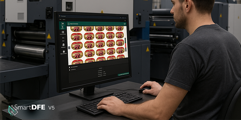
Label Studio – agility where you need it most
Press rooms are fast-moving environments. Jobs change. Deadlines shift. Sometimes you can’t get hold of the prepress team when you need them. Label Studio gives operators the ability to do late-stage planning right there at the press. No sending files back upstream, no waiting. Just quick, efficient job prep that keeps production moving.
And if you need a more advanced editing solution, Hybrid Software’s PACKZ and STEPZ are also available. Both are proven, PDF-native toolkits for prepress and Variable Data Printing (VDP) creation and are designed specifically for labels and packaging.
MISLink – connecting the dots
Another new feature, MISLink, offers seamless connection to Management Information Systems (MIS) and Enterprise Resource Planning (ERP) platforms . Built on Hybrid Software’s CLOUDFLOW workflow suite, it connects SmartDFE directly to your systems to give smooth data exchange and better transparency.
And it scales with you. MISLink starts with a foundation CLOUDFLOW installation that grows as your needs do. Plus, Hybrid Software’s services team can help make integration with your existing systems seamless.
You can see the new SmartDFE V5 in action at Labelexpo Europe next week on the Hybrid Software stand: 5E55. Contact Justin Bailey for your personal demo : justin.bailey@globalgraphics.com
See the full list of enhancements here: https://documentation.globalgraphics.com/sdfe/smartdfe-v5-0-release-notes
I’m proud to say that last week, Global Graphics Software was formally presented with a King’s Award for Enterprise for SmartDFE. The accolade is the UK’s highest business honor and Global Graphics Software was one of only 46 companies in the UK to be recognized for outstanding innovation.
Find out more about SmartDFE.
About the author

Eric Worrall currently leads the product management and technical services teams, as well as being responsible for the product strategy, position and vision within Global Graphics Software. He has had a wide experience of key roles including senior software developer, technical support, sales and product management, and has over twenty years of market knowledge in printing, digital documents, machine vision technologies.
Be the first to receive our software release updates, blog posts, company and product news. Why not subscribe to our newsletter? Subscribe here